slurvo.com
Landing Page Analysis
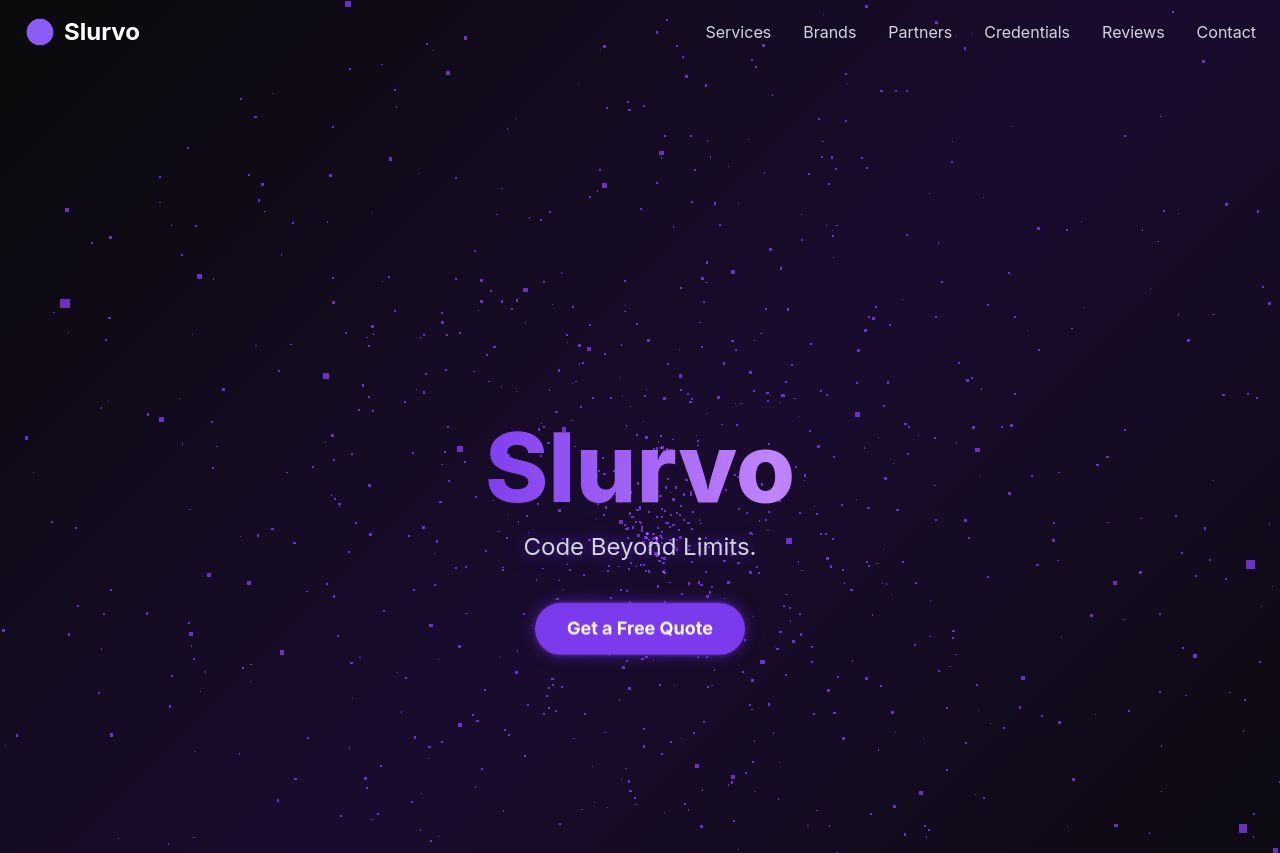
Code Beyond Limits.
Summary:
The overall design of the Slurvo landing page is visually appealing, using a cohesive color scheme with dark themes and prominent calls to action. The use of badges for credentials and logos for partners and brands adds credibility. However, the main issue lies in the messaging and readability.
While the layout itself is clean, the main value proposition is unclear in the hero section, using vague phrases like "Code Beyond Limits" without specifying what the service actually offers. There are a lot of trust signals, but the page lacks specificity in describing services and fails to effectively communicate to the target audience of B2B SaaS Founders. There is also a lack of engaging copy, making the sections feel bland and not engaging enough.
The CTA is visible but lacks urgency or specificity, and tonal consistency feels off due to the absence of clear language targeting decision-makers in the tech industry. Each section transitions logically, but enhancements in clarity and engagement would improve the user's overall journey.
- Clarify the main value proposition to be more specific about services offered.
- Enhance the call-to-action to include urgency or specific benefits.
- Revise copy to better target B2B SaaS Founders with industry-specific language.