leo-kraus.com
Landing Page Analysis
Wir schätzen Ihre Privatsphäre
Summary:
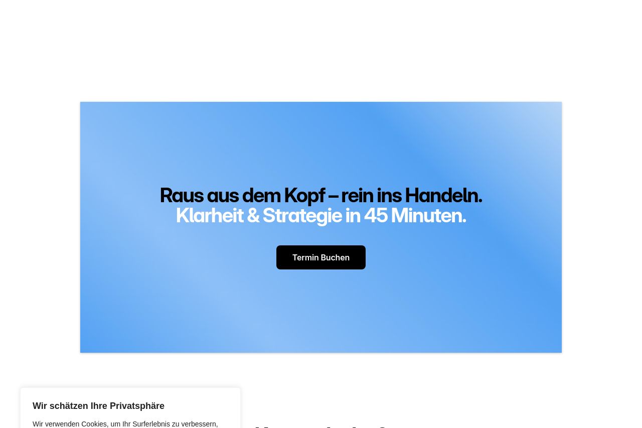
The landing page attempts to create an engaging and personalized experience, aiming to drive users to book a mentoring session. The bold headings and the emphasis on a "45-minute strategy" are clear and straightforward. However, the call-to-action buttons like "Termin Buchen" are somewhat repetitive and visually bland, making them less compelling. The text blocks are dense, which could deter some visitors, and the cookie consent box is overly intrusive, repeating itself annoyingly throughout the page.
There's a decent visual balance, with some use of whitespace to reduce clutter. But, the imagery and illustration usage lacks depth and engagement, making the sections feel static and uninspired. The trust elements are present, such as client logos and certification mentions, which add credibility. The content explains the program in detailed steps but can be overwhelming due to a lack of concise language and visual distinction among sections. While personalization is touted, it sometimes feels generic due to less dynamic visual interaction or real-life examples.
- Make CTAs more visually appealing and varied.
- Reduce repetitive cookie consent pop-ups.
- Add more engaging imagery or illustrations to break text heaviness.