systeme.io
Landing Page Analysis
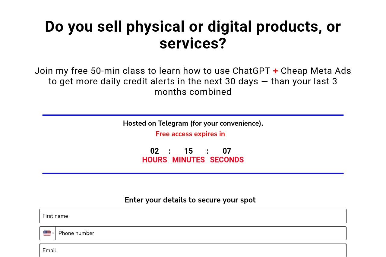
Do you sell physical or digital products, or services?
52
Generated on:
September 13, 2025Score:
52/100Audience:
Product sellers and service providers Share on:
Summary:
45
Messaging
55
Readability
50
Structure
55
Actionability
45
Design
50
Credibility
The page has some clear call-to-action moments with a strong offer but lacks depth in messaging. The use of urgency with a countdown timer is a good tactic, but the design is cluttered and can distract rather than engage. While testimonials are present, they are poorly formatted. The design does not seem professional, with inconsistencies in color use and typography. There are a lot of repetitive sections that don't add much new information, causing the user to potentially lose interest. Overall, it's a mix of good intentions executed poorly.
Main Recommendations:
- Simplify the design and focus on a single visual style to avoid clutter.
- Use a more consistent and professional color scheme to enhance readability.
- Rework the testimonials section to be more concise and visually appealing.