google.com
Landing Page Analysis
If you’re reading this right now, it means you’ve been thinking about building an online business. Maybe you’ve heard the buzz about e-commerce.
61
Generated on:
September 13, 2025Score:
61/100Audience:
E-commerce Share on:
Summary:
70
Messaging
60
Readability
60
Structure
50
Actionability
65
Design
40
Credibility
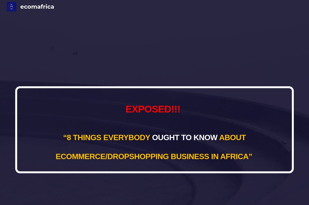
The Open Graph setup here is a disaster for catching attention. The title "ecomafrica" is vague and doesn't do anything to explain what the page is about or entice curiosity. The description is cut off mid-sentence, making it entirely ineffective and unprofessional. It reads more like an accidental blurb pulled from the intro. The image itself doesn’t clearly convey the message or relate strongly to e-commerce, meaning viewers won’t be enticed just by seeing it.
Main Recommendations:
- Use a more vivid and descriptive title like "Unlock E-commerce Profits in Africa".
- Craft a concise and full description that encapsulates the offering, such as "Discover essential insights to thrive in Africa's burgeoning e-commerce market. Learn, grow, succeed."
- Replace the image with something engaging—perhaps showcasing success or representing e-commerce visually in a more dynamic and appealing way.