mysoluta.com
Landing Page Analysis
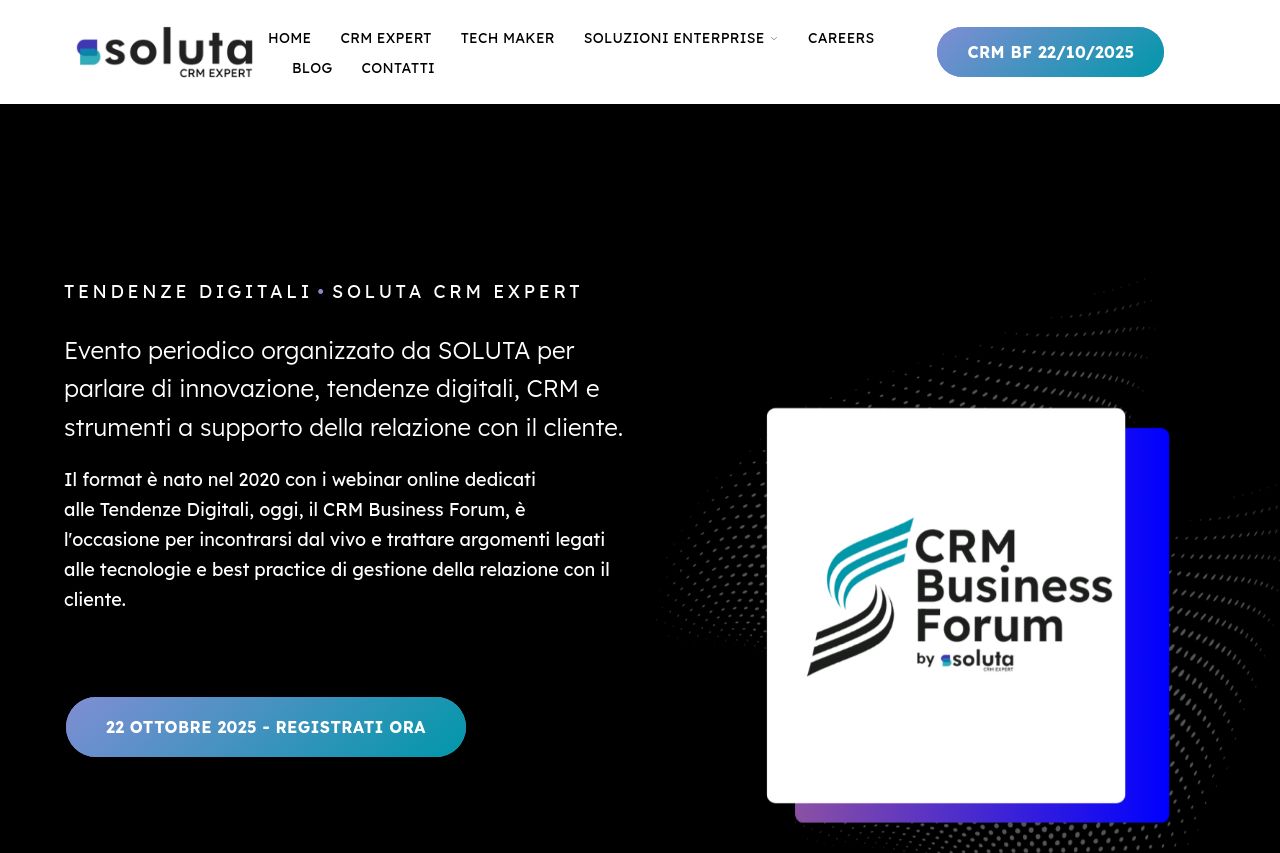
Evento periodico organizzato da Soluta per parlare di innovazione, tendenze digitali, CRM e strumenti a supporto della relazione con il cliente.
Summary:
The landing page feels sleek and modern but struggles with clarity and engagement. The dark background provides a contemporary feel, yet some text contrasts are weak. Sections are visually appealing with the use of images and bold headers but lack in providing a clear, concise message. There's an attempt to include key information like previews and use cases, yet it's buried within long paragraphs. The CTA buttons are visible but rather dull, lacking personality and urgency. Despite intricate design elements, the value proposition isn't crisp, making it hard to extract what exactly the user stands to gain.
- Clarify the value proposition in the main headline to quickly convey the benefits.
- Enhance readability by breaking long paragraphs into bullet points or subheadings.
- Strengthen CTA placements and make them more enticing with action-driven text.