oenai.one
Landing Page Analysis
موجز إخباري ,في الوقت الفعلي لأحدث ,عناوين التكنولوجيا,والهواتف الذكية,والتطبيقات

Summary:
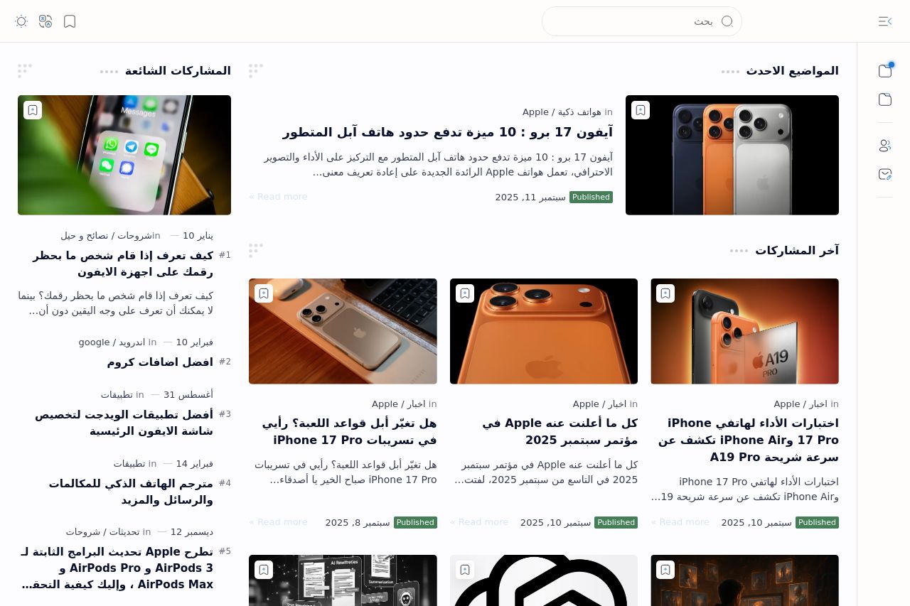
The page is cleanly organized but feels a bit overwhelming with the sheer volume of content displayed at once. There’s a common theme of technology, which is cohesive, but the visual differentiation could be improved to better highlight the newest and most important articles. The design overall has a solid feel but lacks strong contrast, which makes the content blend together too much. The use of images could be better curated to match the headlines and content more effectively. CTAs are not prominent, making engagement suffer, as users might not know where to click next for immediate interaction. The text is clear but borders on overly repetitive territory without much visual break or standout formatting like bold or headings. Finally, the website maintains a professional look, though it sometimes feels a bit too plain and lacks engaging unique design elements.
- Enhance the color contrast to make the CTAs and headlines stand out more.
- Divide the content into more visually distinct sections to guide the reader's flow better.
- Use more engaging imagery that directly relates to the article's content to capture interest.