vercel.app
Landing Page Analysis
Generated by create next app
Summary:
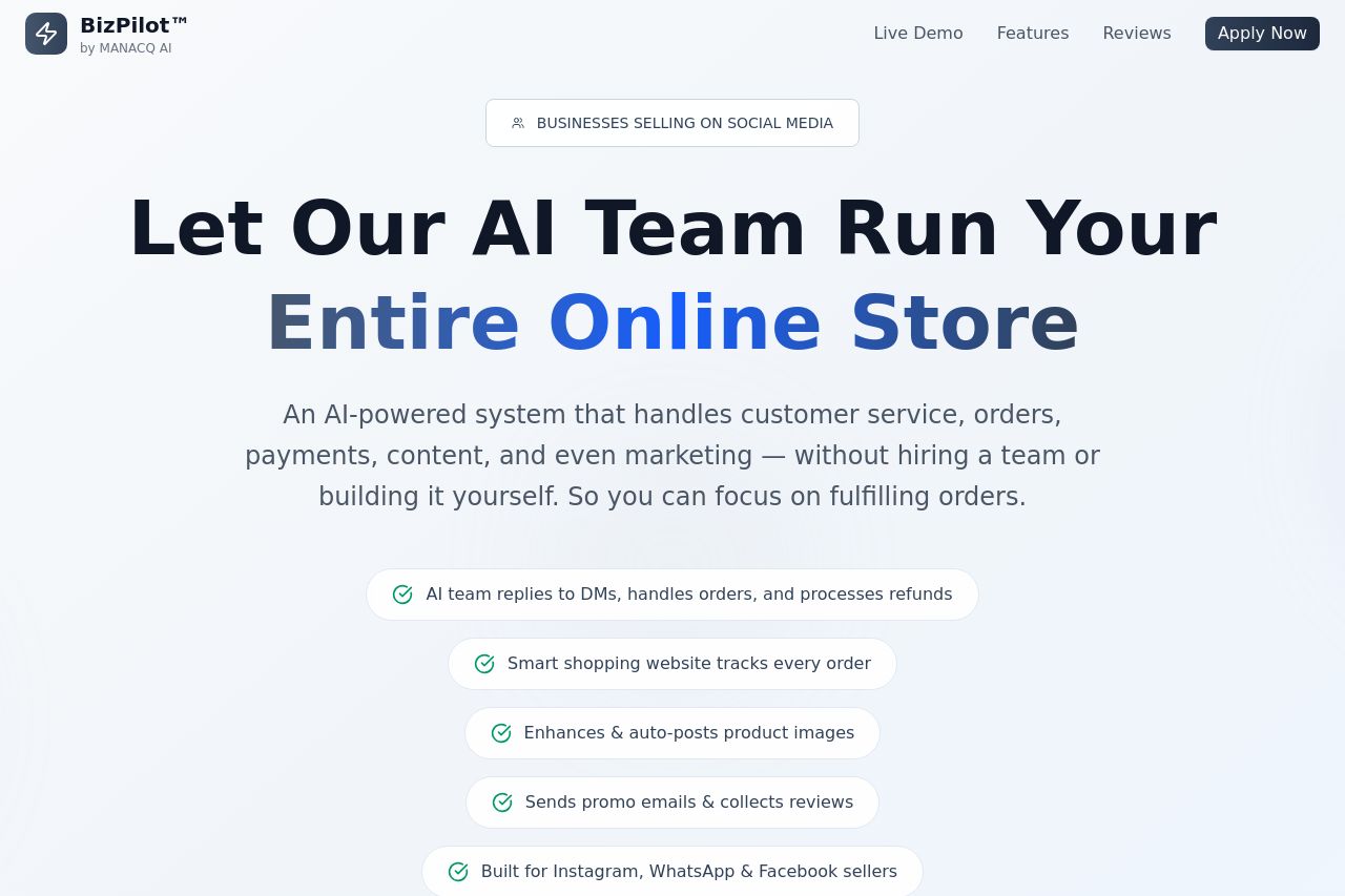
The landing page effectively conveys its value proposition with a clear emphasis on automation and efficiency for online stores. The bold headline "Let Our AI Team Run Your Entire Online Store" immediately communicates what the service offers. The supporting text clarifies that it's aimed at business owners who want to focus on fulfilling orders rather than managing various tasks. However, the design feels overly simplistic, occasionally bordering on bland. While this might enhance readability, it also risks being forgettable. The use of icons and bullet points helps communicate features effectively, yet they lack visual excitement.
The security badges and money-back guarantee bolster trust, but the lack of client logos might make it harder to assess the service’s credibility. The inclusion of a comparison table explaining the advantages of their service over alternatives is smart but could benefit from more visually striking presentation. The CTA button placements are logical, positioned well after each section; nevertheless, the CTAs themselves lack urgency or enticing language that prompts immediate action.
- Enhance the design with more vibrant colors or imagery to avoid blandness.
- Incorporate recognizable client logos or testimonials to build credibility.
- Revise CTA text to create a stronger sense of urgency or appeal.