vercel.app
Landing Page Analysis
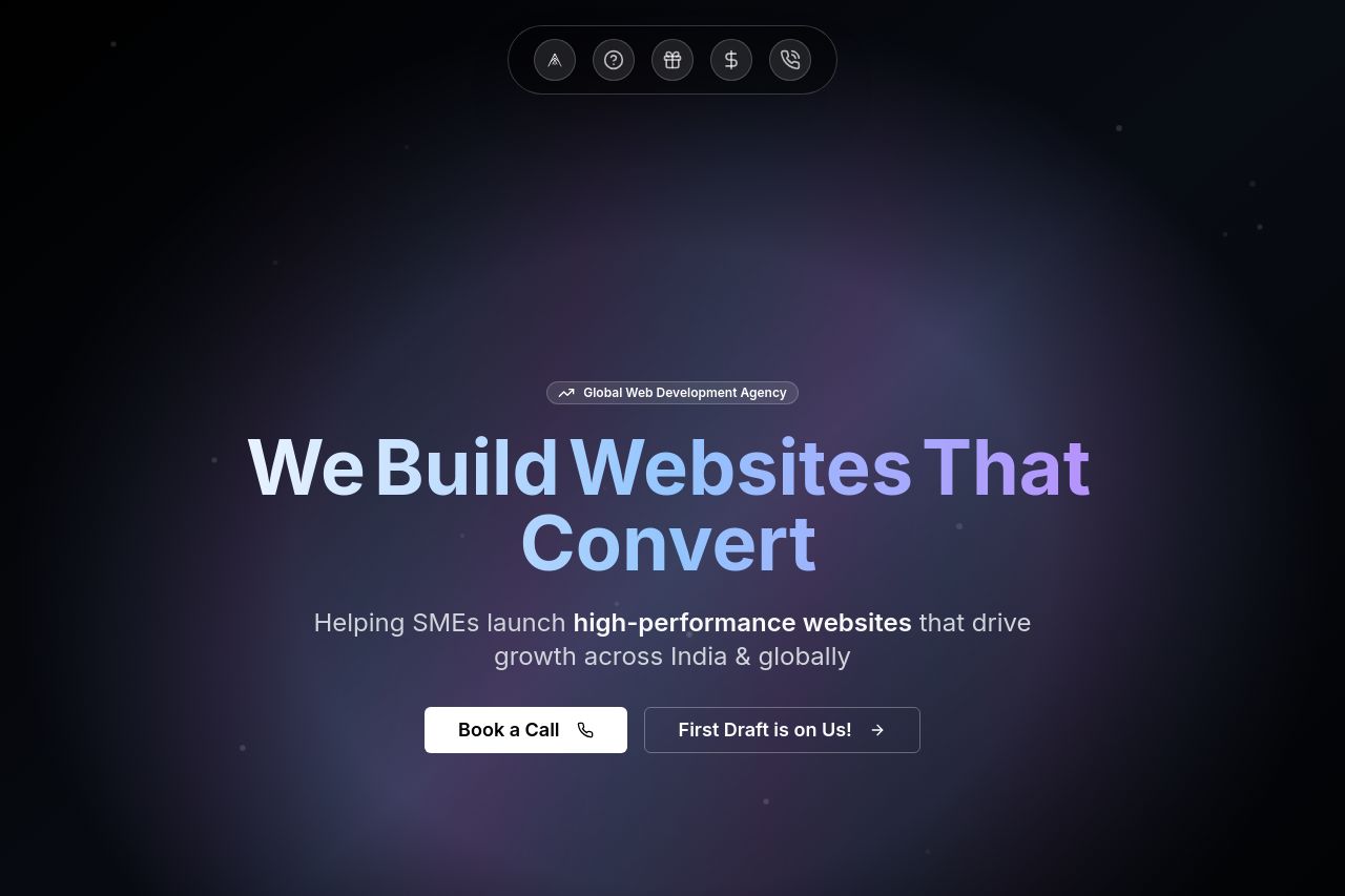
Global web development agency helping SMEs launch high-performance websites that drive growth across India & globally.
84
Website:
https://cacheup.vercel.appGenerated on:
September 10, 2025Score:
84/100Audience:
Small to Medium sized Service based business ownersShare on:
Summary:
80
Messaging
80
Readability
85
Structure
85
Actionability
80
Design
70
Credibility
The landing page's design is visually cohesive, utilizing a dark theme with vibrant text that stands out, making it easily readable. The messaging is clear, specifically tailored to SMEs looking to expand their online presence globally, with a focus on conversion. The CTAs are well-placed and stand out, although some sections appear a bit text-heavy, which could overwhelm users. The credibility is bolstered by the mention of "hundreds of businesses," yet lacks specific testimonials or badges to reinforce this claim. Overall, the content flow is logical, but headings could better differentiate sections for improved scanning.
Main Recommendations:
- Add testimonials or client logos for credibility.
- Simplify and break down complex text blocks for easier reading.
- Enhance heading differentiation to improve navigation.