indiepa.ge
Landing Page Analysis
Everything you build, your apps, your revenue, in one simple link in bio. Linktree for entrepreneurs. Create your Indie Page for free!
Summary:
The Indie Page website is a mixed bag of clear value propositions but suffers from some design and structural issues.
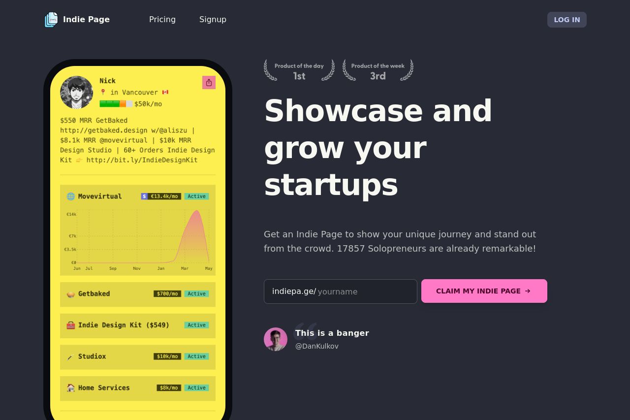
Pros: The main value proposition of showcasing and growing startups is immediately clear, which is a big win. The product's benefits are well-communicated across different sections with consistent messaging that speaks directly to solopreneurs, who are the intended audience.
Cons: The page is cluttered with too many testimonials, which are squished together, making it hard to distinguish individual feedback. The hierarchy is inconsistent with random sizing and weight differences in fonts that disrupt visual flow. The color scheme does lift some key areas, but it doesn't always highlight the most essential elements, like CTAs.
Usability is compromised due to the muddled structure and sometimes confusing navigation paths. Though CTAs are present, their placement feels off, lacking strategic positions that would likely boost conversion rates. Credibility is there, but more could be achieved by showcasing partnerships or logos newer or more prominently.
- Improve the visual hierarchy by adjusting font sizes and weights for consistency.
- Reorganize testimonials to make them distinct and more visually readable.
- Place CTAs more strategically throughout the page to enhance actionability.