stablesea.xyz
Landing Page Analysis
Stable Sea provides global liquidity for companies building in stablecoins.
Summary:
The landing page does a solid job in presenting Stable Sea's core offerings with a decent emphasis on stablecoins. The value proposition is somewhat clear, but the lack of explicit audience targeting muddles the message. The use of color is cohesive, and the design maintains a professional look without being groundbreaking. However, the CTA "Talk to our founders" feels awkwardly placed and doesn't stand out as much as it should.
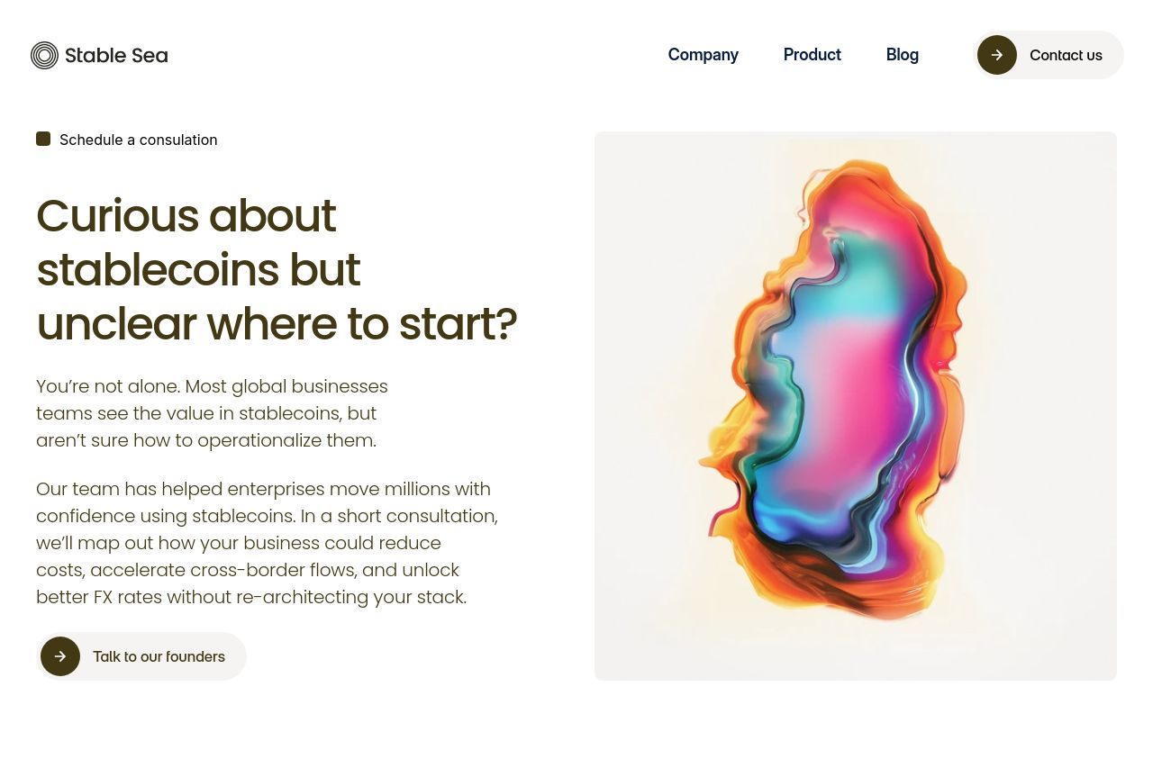
The layout is logical, guiding the reader through problem identification to the solution, but it lacks dynamic elements that could better capture attention. The text is kept simple, but there's a lack of hierarchy in typography that could enhance readability.
While there are some trust-building elements like explanations of benefits, the absence of direct social proof or testimonials weakens credibility. There’s transparency in communication, yet the sparse reinforcement of expertise or customer success stories could leave visitors skeptical.
- Refine the value proposition to be more explicit and engaging with direct benefits to the audience.
- Enhance the visual hierarchy with varied typography sizes and weights to improve readability.
- Include testimonials or case studies to boost credibility and trust.