ronitkedia.com
Landing Page Analysis
Portfolio - Ronit Kedia
61

Share on:
Summary:
55
Messaging
70
Readability
70
Structure
50
Actionability
60
Design
40
Credibility
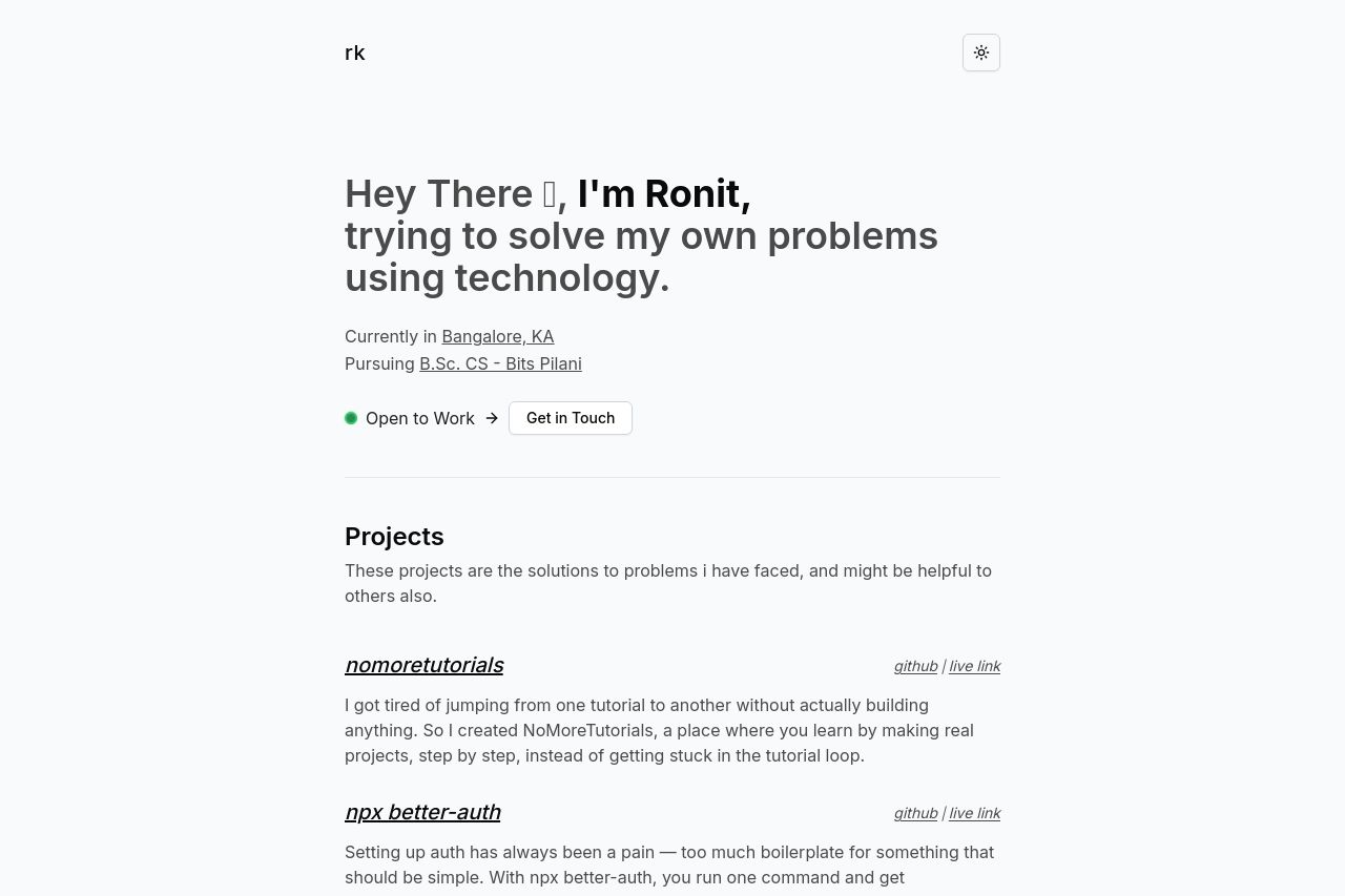
The page takes a minimalistic approach, showcasing a personal, straightforward introduction. The headline, "Hey There 👋, I'm Ronit," is somewhat engaging but lacks specificity about what problems they solve with technology, missing a bit in clarity. Projects like "nomoretutorials" are well-explained, offering personal insights into the creator's mindset. However, the lack of visual aids makes it appear text-heavy and dull. The social links at the bottom could be more prominent, and the "Get in Touch" button is inviting but could be more visually distinct.
Main Recommendations:
- Enhance visual engagement by adding relevant images or icons to support text.
- Improve the contrast and visual hierarchy for better readability and emphasis.
- Make the 'Get in Touch' button more visually distinct.