landinganalyze.com
Landing Page Analysis
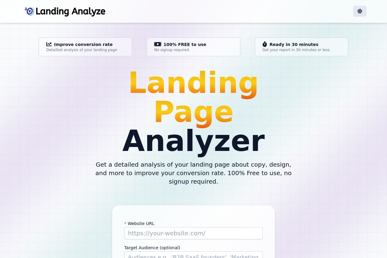
Get a detailed analysis of your landing page about copy, design, and more to improve your conversion rate. 100% Free to use, no signup required.
Summary:
The landing page offers a straightforward and effective presentation of the tool's benefits with a clear message about its free offering. The bold use of color in the "Analyze my Landing Page" button draws attention effectively, although the background grid can make the page feel somewhat busy.
The section highlighting "Lastest landing pages analyzed" provides social proof, enriching credibility, but the term "lastest" needs correction. The shadow effect on cards is nice, but visuals could be more engaging to break the monotony.
The FAQ section is a useful addition, but formatting could be enhanced with an accordion effect to improve the browsing experience. Overall, the page aligns well with its target B2B audience.
- Correct the typo "lastest" to "latest".
- Improve visual engagement by adding more relevant images or icons.
- Refine the FAQ layout with an accordion design for better UX.