flux-28.com
Landing Page Analysis
FLUX28 STUDIO is an award winning multidisciplinary studio that specializes in visual effects, 3d animation, A.I and creative direction.
Summary:
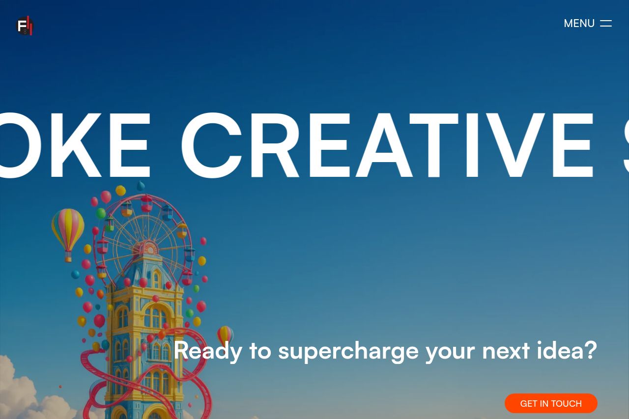
The landing page presents a bold and modern design with a strong visual appeal, notably utilizing stark contrasting colors like black, white, and bright orange. The visual approach is eye-catching, but the overly minimalistic design featuring large text in the hero section lacks depth in communication on what exactly is offered. The call-to-action buttons are noticeable, yet the generic copy like "Get in Touch" lacks specificity and compelling urgency. The featured works section shows some vibrant imagery, providing a clear display of portfolio pieces, yet without much context or description, appreciation of the work itself may be lost on new visitors. The use of "Say Hi!" as a prominent section further down the page feels unprofessional, reducing the site's level of seriousness for a creative studio targeting brands. Overall, while the design is visually striking, it lacks substance in messaging and content specifics that would truly engage and reassure potential clients.
- Clarify the value proposition with specific services and a more targeted message.
- Enhance the complexity of CTAs with action-oriented and specific language.
- Provide context or descriptions for featured works to give viewers insight into the projects.
- Refine the tone to a more professional style, especially in engagement elements like 'Say Hi!'.