flowengineering.com
Landing Page Analysis
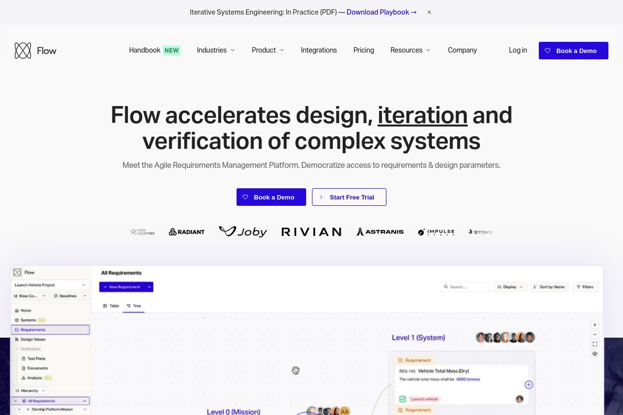
Flow provides new-age engineering companies with a requirements tool that is built specifically for their needs and allows them to focus on engineering ground breaking products.
Summary:
The Flow website effectively presents its offerings with a clean and professional design. The hero section prominently displays brand recognition with client logos, reinforcing credibility. The value proposition is clear, highlighting agile systems for complex engineering requirements. The visuals and color consistency are decent, although the color scheme could use a bit more contrast to make CTAs stand out better. Navigation is intuitive, though some sections could benefit from more distinct headings to guide the user. The typography is basic, which aids readability, but borders on dull. The trust elements are prominently displayed, with customer logos and testimonials boosting credibility. However, some sections are overly technical and lack engaging language tailored to a broader audience. The pricing section is informative but could benefit from a clearer breakdown or emphasis on the unique selling points that justify the cost.
- Enhance the CTA buttons with more contrast and action-oriented text to increase conversions.
- Simplify technical jargon to make the page more accessible to non-expert visitors.
- Improve text hierarchy within sections to guide the user's focus.