landingsite.ai
Landing Page Analysis
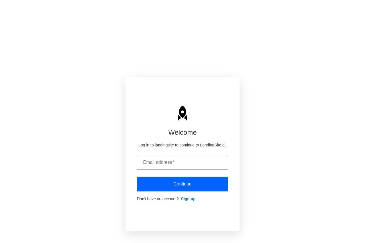
Log in to landingsite to continue to LandingSite.ai.
Summary:
The landing page is minimalist but somewhat lackluster. It offers a straightforward login interface with an email field and a call-to-action button for continuation. The logo is simple, but there's nothing visually engaging to catch the viewer's attention. The CTA "Continue" and the link "Sign up" are clear but generic. There's no attempt to outline any value proposition or give context about why the user should bother signing up. There's no imagery or engaging elements to draw users in, leaving the page feeling empty and overly basic.
The typography is readable, but the lack of style or hierarchy makes it dull and uninspired. The color palette is bland, and no design elements elevate the page to be memorable or professional. The absence of any messaging or branding means the page fails to communicate any sense of brand identity or trust.
- Incorporate a clear value proposition to inform users of benefits.
- Add imagery or icons that reflect brand identity.
- Enhance the CTA with more specific, action-oriented language.