althara.it
Landing Page Analysis
Diagnosidefinitiva
Summary:
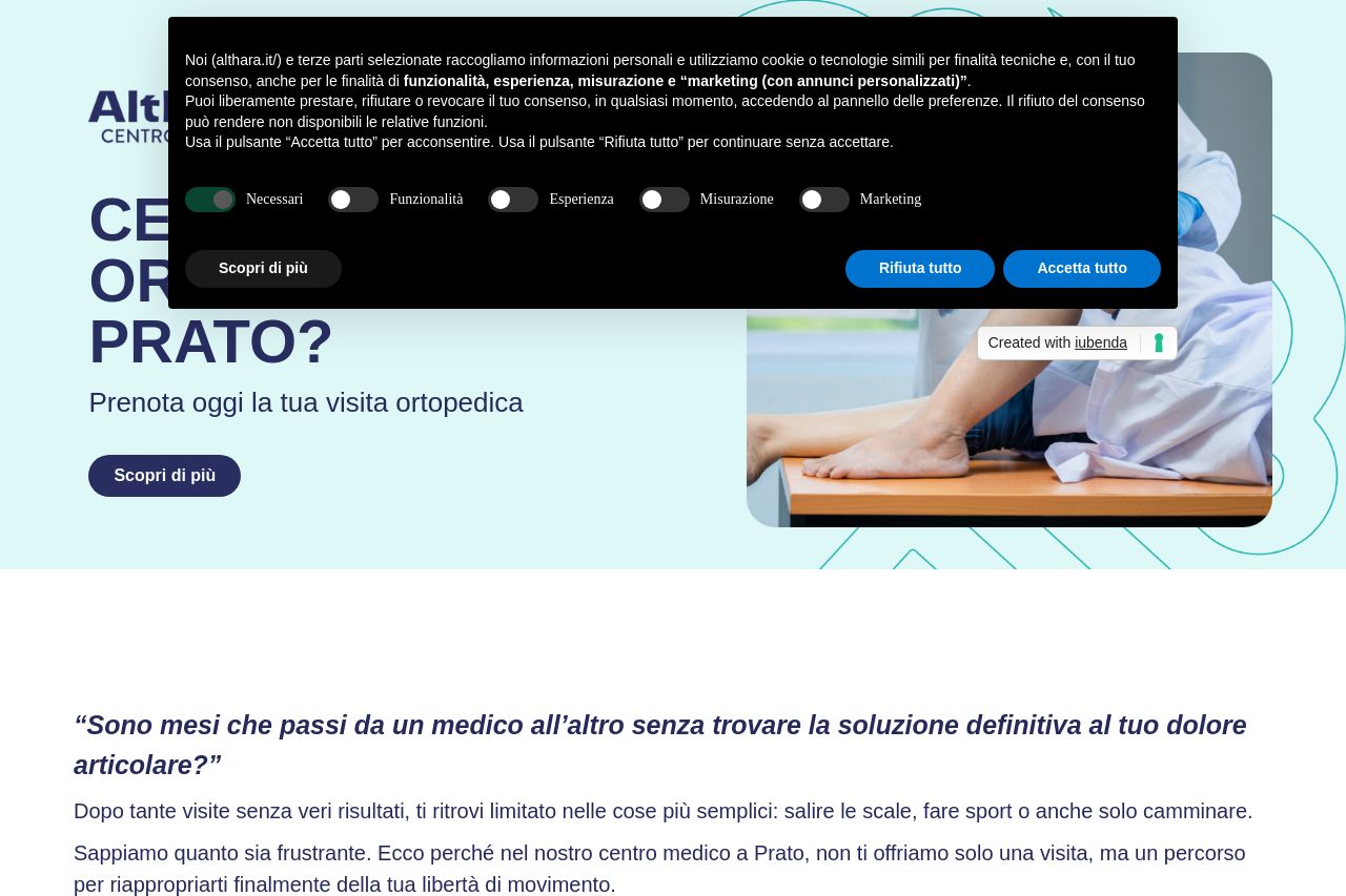
The landing page aims to promote orthopedic services with an intense focus on booking visits and emphasizing its unique value. Good points include a clear call to action throughout the page and effective use of testimonials which lend credibility. The visual hierarchy is decent, though nothing groundbreaking, with legible typography and consistent use of colors that align with a medical theme. However, the page has serious flaws. The cookie consent box is intrusive and repeatedly appears in screenshots, overshadowing important content. Messaging feels generic without sharply defined audience targeting or compelling differentiation—it's not enough to just say you're the best. The reading flow is disrupted by cluttered sections, making key information easy to miss. Furthermore, actionability is weakened by less-than-ideal placement and wording of CTAs that don't scream urgency or necessity. In the case of credibility, even though there are trust elements like reviews, the layout feels templated rather than bespoke, impacting professionalism. Structural issues include information redundancy, where repeated CTA content wastes valuable space.
- Revise the CTA text to be more actionable and specific, like 'Book Your Appointment Today!'
- Improve visual hierarchy: use different font sizes and weights to guide the reader's eye.
- Integrate more targeted messaging to clearly define who this service is for and why it stands out.