danban.org
Landing Page Analysis
Investor
Summary:
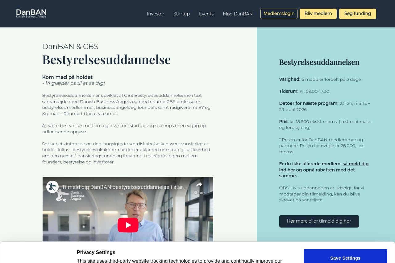
The landing page for DanBAN's board education is a mixed bag. On the positive side, the layout feels professional, and the use of trust elements like testimonials enhances credibility. However, the page struggles with messaging clarity; the value proposition isn't immediately obvious, which can confuse potential customers.
Design-wise, the visual hierarchy could be improved. Headings don't stand out enough, and the reader's eye isn't guided effectively through content. Colors are consistent, but they lack contrast, making certain elements blend instead of pop. The shadow on the background doesn't add much clarity and instead feels distracting.
The calls to action are well-placed, although their visibility could be enhanced to stand out more. Yet, the tone of voice doesn't fully match the C-suite audience, missing a more authoritative and persuasive edge.
Structurally, the page flows logically but lacks engagement, as it is text-heavy without enough engaging visuals or bullet points to break the monotony. There's a lot of text explaining course format and content but not enough to immediately engage potential attendees about what makes this course indispensable.
- Strengthen the value proposition by clearly stating benefits and what makes this education unique.
- Enhance the visual hierarchy with larger, bolder headings to guide the reader through the content.
- Improve CTA visibility and engagement with more contrast and action-oriented language.
- Condense and break up text with engaging visuals or bullet points to improve readability.
- Tailor tone of voice more directly towards C-suite professionals with concise and persuasive language.