rightlensai.com
Landing Page Analysis
A tool that connects everyday work into one space. It gives you and your teams AI tools—search, writing, note-taking—inside an all-in-one, flexible workspace.
79
Website:
https://rightlensai.comGenerated on:
September 9, 2025Score:
79/100Audience:
Philippine dental clinics and local SMEsShare on:
Summary:
60
Messaging
80
Readability
70
Structure
70
Actionability
75
Design
100
Credibility
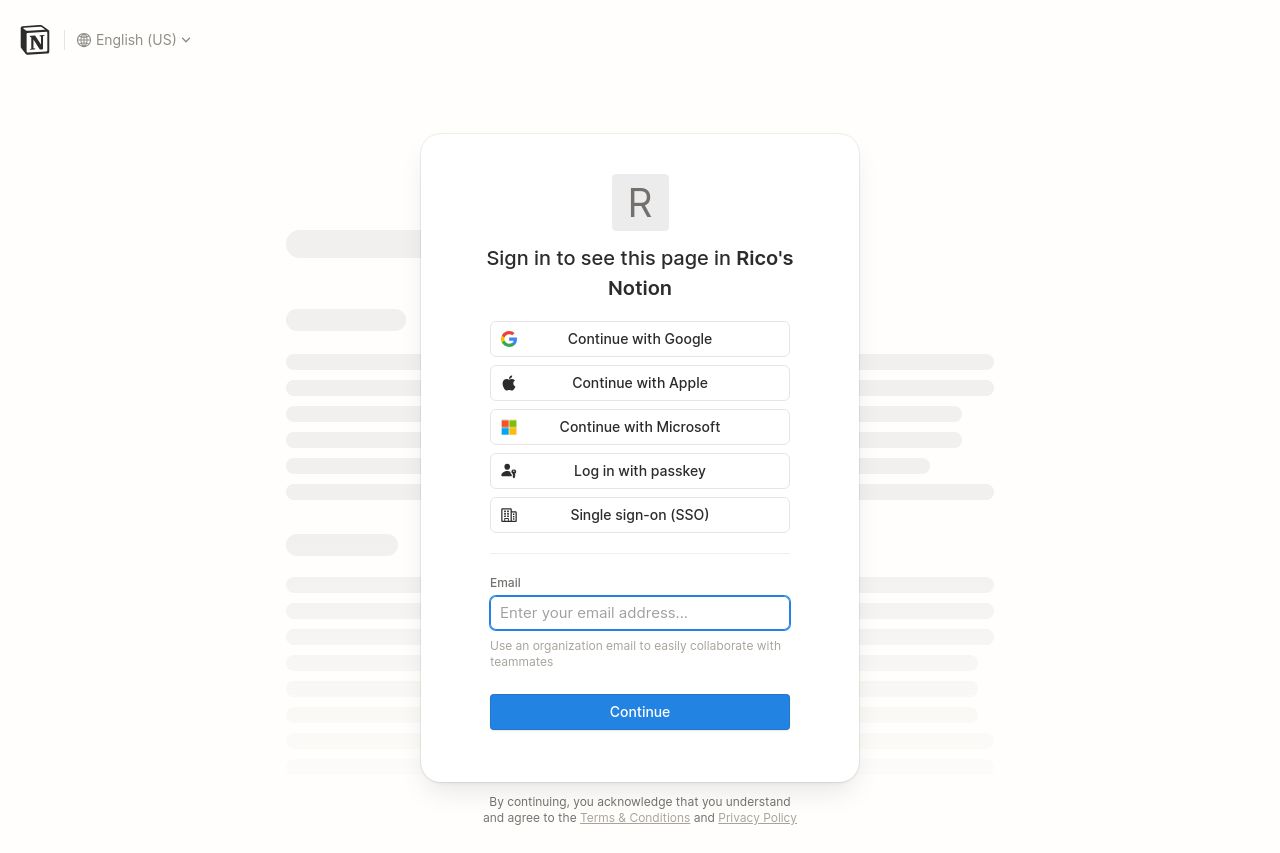
Clean and focused login page that manages to keep distractions minimal. Straightforward options for logging in make it user-friendly. However, lacks personality and warmth, which could make it feel a bit mechanical for new users. Functional but not inviting, it could use some color and flair to make it more welcoming for first-time visitors. The layout is clear but feels somewhat bare-bones. A clearer value proposition could help entice new users who may be unsure about signing up.
Main Recommendations:
- Add a brief value proposition or benefit statement to entice new users.
- Incorporate a welcoming visual or color scheme to reduce the sterile feel.
- Consider a call-to-action or inviting message next to login options.