rightlensai.com
Landing Page Analysis
A tool that connects everyday work into one space. It gives you and your teams AI tools—search, writing, note-taking—inside an all-in-one, flexible workspace.
Summary:
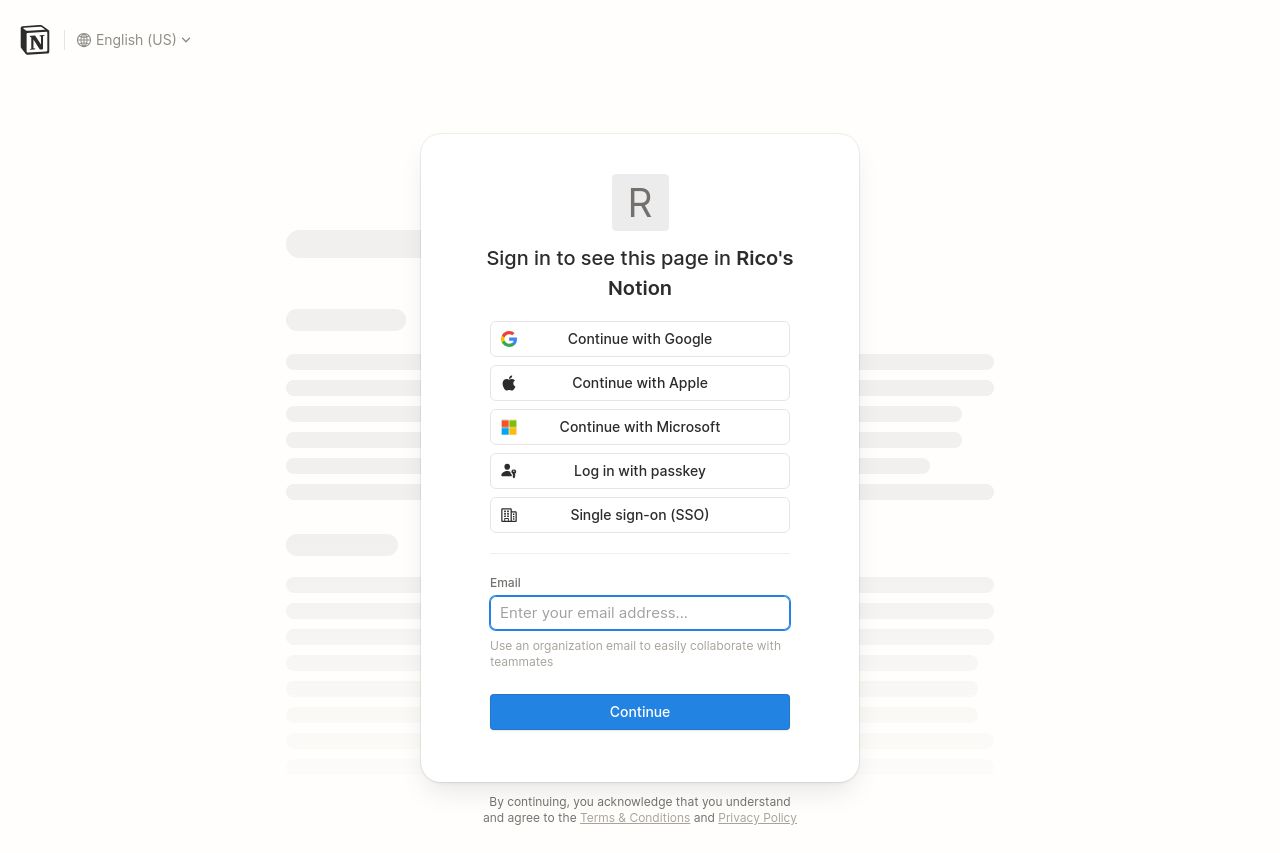
Overall, the landing page for Notion's sign-in is bland and uninspiring. The central focus is entirely on the login process, which is understandable, but there's a lack of engaging design to draw in the user. The color palette is plain white, which might be clean but is also quite dull, lacking energy and excitement. The form itself is straightforward and user-friendly, which is a saving grace. However, the lack of any enticing imagery or engaging copy leaves a lot to be desired, especially when trying to give users a sneak peek into what awaits them beyond the sign-in page. The functionality is there, but there's no flair or charm that might entice new users or reassure them about the value that lies in Notion's unique workspace.
- Incorporate engaging visuals to make the page more inviting.
- Add concise, persuasive text above the login options to remind users why they should sign in.
- Consider including a brief quote or testimonial from a user for added credibility.