rovellaathletic.com
Landing Page Analysis
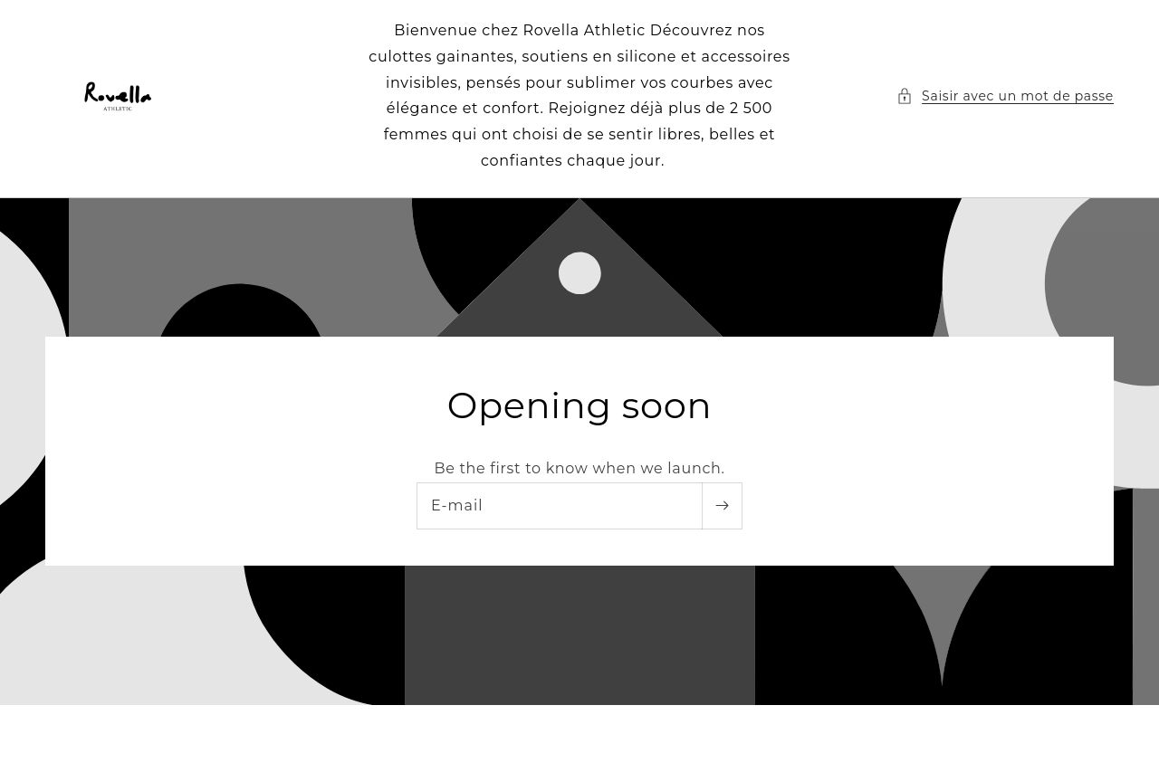
Be the first to know when we launch.

Summary:
The landing page aims for a minimalist approach but falls flat in effectively engaging the audience. The lack of any compelling graphics or engaging content is a major misstep. The primary message about the brand is there but lacks impact due to the uninspired typography and layout. The "Opening soon" CTA is mundane and doesn't entice immediate action. While the attempt at using whitespace keeps the design clean, it also makes the page feel underdeveloped—almost like an empty promise. There's a stark lack of information or enticing visuals to hook potential customers. This could leave users wondering why they should care—or worse, leave them without a second thought. There’s a hint at social proof with the subscriber count, but it’s buried and not visualized effectively to build trust. Ultimately, this page doesn’t convey the excitement or urgency needed for a launch.
- Add engaging graphics or images related to the product to build interest.
- Improve the call-to-action with more persuasive language or a graphical button.
- Incorporate stronger social proof elements like testimonials or subscriber milestones.