co.uk
Landing Page Analysis
Home Front
81
Share on:
Summary:
60
Messaging
90
Readability
90
Structure
60
Actionability
75
Design
90
Credibility
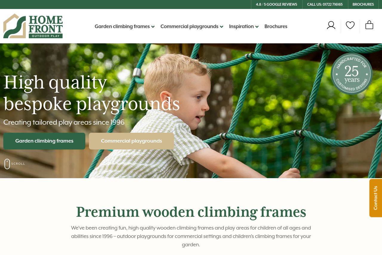
The homepage is visually appealing with a clean and natural look, befitting the product's focus on outdoor play areas. Excellent use of imagery showcasing the products gives potential customers a clear idea of what's on offer. However, the value proposition and target audience could be more explicitly communicated. The call to action buttons could use a bit more oomph—"Get a quote today" and "Buy now" are serviceable but lack urgency or creativity. The typography is clean and easy to read, though more emphasis on visual hierarchy could enhance the experience. Social proof elements like testimonials and recent projects are a plus, although further details could solidify trust.
Main Recommendations:
- Enhance the value proposition with clearer messaging about what differentiates the brand from competitors.
- Revamp CTAs to be more engaging and urgent, like 'Explore Custom Designs' or 'Claim Your Play Space'.
- Adjust the visual hierarchy by using varying font weights and sizes to emphasize key sections.