bestchoiceguide.net
Landing Page Analysis
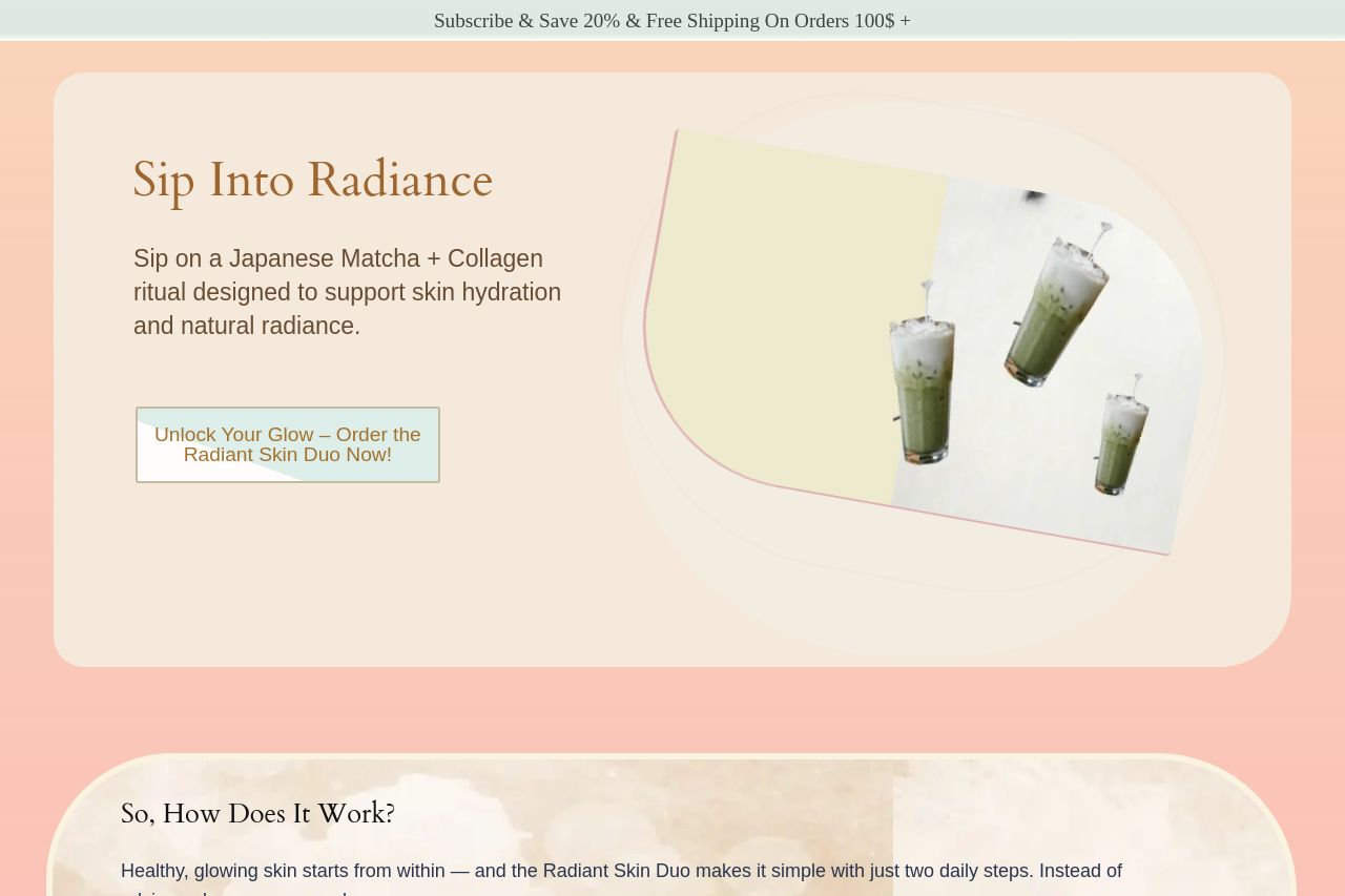
Healthy, glowing skin starts from within — and the Radiant Skin Duo makes it simple with just two daily steps. Instead of relying only on creams and serums,
Summary:
The landing page for Sun Goddess Matcha lacks clarity and focus, which heavily impacts its effectiveness. The value proposition isn't impactful or exciting; using generic phrases like "Sip Into Radiance" doesn't directly communicate uniqueness or benefits. While attempting to highlight skin hydration and natural radiance, it misses the target by not focusing on specific aesthetic or functional benefits.
Design choices are inconsistent, with random color choices that look disconnected and amateurish. Typography fails to create visual interest or a hierarchy; everything blends, making it hard to focus on key elements. Readability suffers from dense blocks of text and weak typography hierarchy, leaving the reader overwhelmed or uninterested. CTA placement and wording are poor, lacking action-oriented messaging and visibility to draw attention. Although it mentions a price, which is good, it buries this information rather than letting it stand out.
Lack of credibility findings further damage trust, since there's little to no inclusion of testimonials, reviews, or professional endorsements. Additionally, there are minor transparency issues, as trust indicators like a physical address or customer service contact info are missing.
Overall, this is a bare-bones effort that could benefit from a complete overhaul by strategizing messaging, re-designing for professionalism, and reinforcing credibility with social proof or endorsements.
- Improve the main value proposition to clearly articulate what sets the product apart.
- Revise typography and layout to enhance readability and hierarchy.
- Incorporate trust elements like testimonials or expert endorsements to build credibility.