com.br
Landing Page Analysis
Atenção, temos uma oferta especial para você! Apenas 20 vagas disponíveis!
Summary:
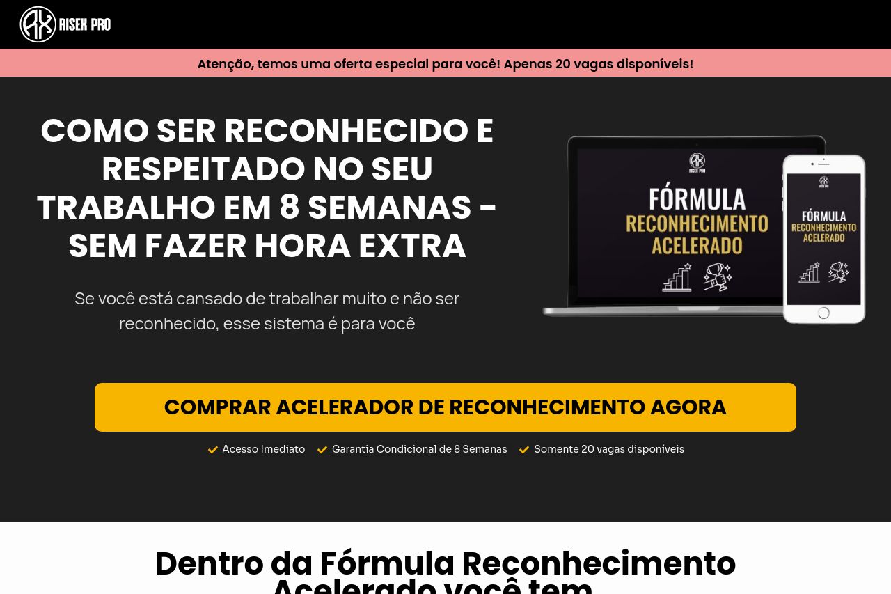
The landing page presents an interesting concept but struggles with impactful delivery. The headline is bold and certain, clearly stating a goal, but it's not powerful enough to grab urgency or uniqueness without repetition and emphasis.
The design has moments where it shines with high contrast and a structured arrangement of information. However, it's let down by excessive text that becomes overwhelming and lacks engaging visuals. The color scheme and typography are generally consistent, aligning with the target audience.
On the structure side, the page is loaded with sections that are heavy on text, making it a chore to absorb information. The benefits and features are there, yet they lack compelling hooks, and the lack of engaging imagery doesn't help. A variety of CTAs are present but lack creativity and appeal. They blend in too much and don't create a sense of urgency.
Social proof is wholly absent—this is a huge red flag. With inconsistent and weak messaging, it doesn't quite hit the mark with a convincing argument to make that conversion happen. It's an effort that's commendable but falls short on executing effective, sharp, and memorable content.
- Enhance the main headline with something intriguing and unique to grab attention immediately.
- Reduce text and make use of bullet points to improve readability and retention.
- Add social proof like testimonials or trust badges to raise credibility.