jefsei-seguros.com
Landing Page Analysis
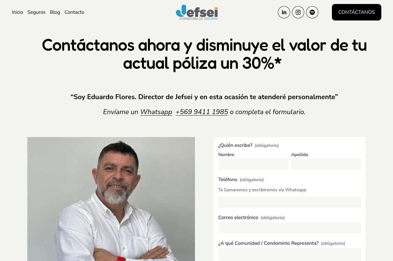
Reduce tu póliza de seguros en condominios, edificios y áreas comunes hasta 30%.
Summary:
The landing page for Jefsei offers a clear value proposition, especially with the promise of reducing premiums by 30%. The use of personal messaging by the Director implies a personalized touch, which can build trust. However, the design lacks a strong visual hierarchy and feels a bit cluttered, with too many elements fighting for attention. The CTA is decent but could stand out more given its importance. The readability is hindered by large blocks of text with insufficient formatting, making it tedious to digest the information. Credibility is bolstered by including a photo and contact information, but the overall visuals and structure need more sophistication to match the professional tone intended.
- Enhance visual hierarchy by using more distinct font sizes and weights.
- Improve CTA visibility with contrasting colors or a more prominent placement.
- Simplify the text by breaking it into more digestible chunks.
- Ensure consistent use of design elements and color throughout the page.