pornhub.com
Landing Page Analysis
Welcome to Pornhub.com, home of the best hardcore free porn videos with the hottest adult stars. Get full length scenes from your favorite porn studios 24/7!

Summary:
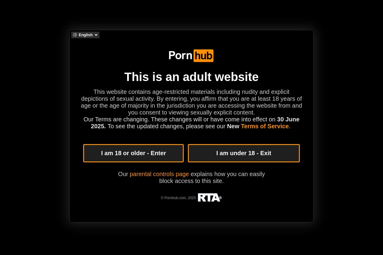
The landing page is direct, functional, and gets straight to the point, which is fitting for an adult website trying to establish clear boundaries about age restriction. However, the design is very basic and lacks any creativity or modern aesthetic appeal. The use of black and orange is consistent, aligning with brand identity, but feels quite outdated.
The viewer is immediately hit with a blunt message about the nature of the site and required to verify their age. The call-to-action buttons, "I am 18 or older - Enter" and "I am under 18 - Exit", are simple yet effective, but they blend into the background too much due to the overwhelming black theme and could benefit from greater contrast.
While the site takes steps to inform about parental controls, it’s buried in small text at the bottom, making it feel like a cohesive and streamlined experience isn’t quite there. The plethora of explicit thumbnails below the fold can easily overwhelm users.
Additionally, navigation clarity isn’t prominent, causing a disorienting user experience for those not immediately familiar with the layout. There are ample videos to choose from, but categorization or sorting isn’t apparent until further exploration.
Overall, while the page fulfills basic functionality and communicates the essential content directly, it lacks the finesse and sophistication of a modern design that could enhance user engagement and satisfaction.
- Enhance visual hierarchy by increasing contrast in CTA buttons.
- Simplify and modernize the layout for a cleaner appearance.
- Improve navigation clarity by distinguishing heading fonts/colors.