fertilitysquaremumbai.com
Landing Page Analysis
Dr. Manisha Takhtani Kundnani is the Medical Director and Chief Fertility Consultant at Fertility Square. An MD in Gynecology from PGIMER, Chandigarh, she further specialized in Infertility and ART th
Summary:
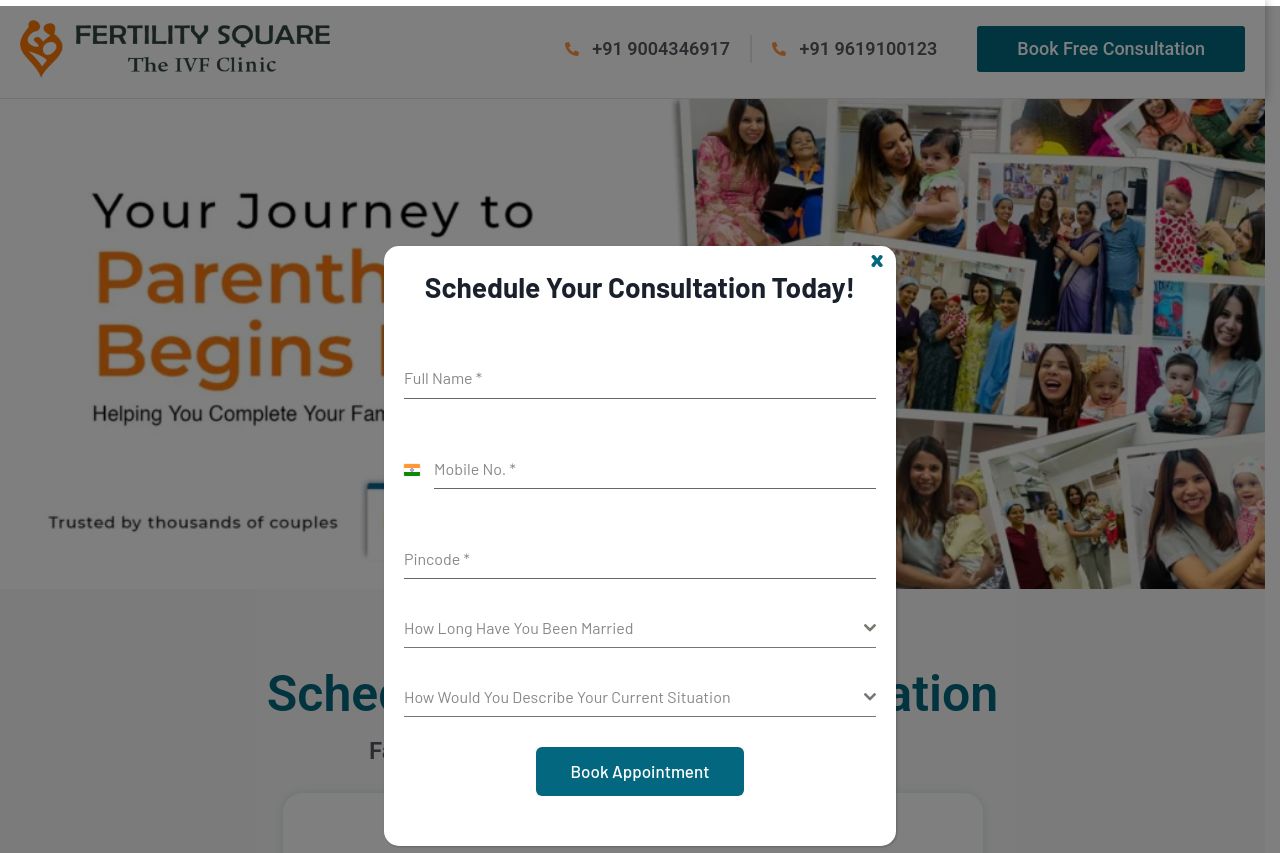
The landing page attempts to connect emotionally with users through images of happy families and children, which is a smart approach for a fertility clinic. The step-by-step IVF process is explained clearly, and there are efforts to establish credibility by featuring a specialist doctor. However, the design feels cluttered especially with the pop-up form constantly obstructing the text. It’s definitely a headache for potential patients trying to find information. The contrast in text isn't great; some important elements are lost in the background. Calls-to-action (CTAs) are present but they don't stand out enough, and the repetitive pop-up is intrusive. Typography is basic, but that's probably the least of the worries here.
- Improve form placement or functionality to reduce intrusiveness, perhaps by making it less prominent or allowing easy closing.
- Enhance CTA visibility using contrasting colors or larger button sizes.
- Optimize text contrast to ensure readability against the background.