minutebio.org
Landing Page Analysis
Explore concise biographies of historical figures, innovators, and influential personalities. Learn about their lives and contributions in just a minute.
Summary:
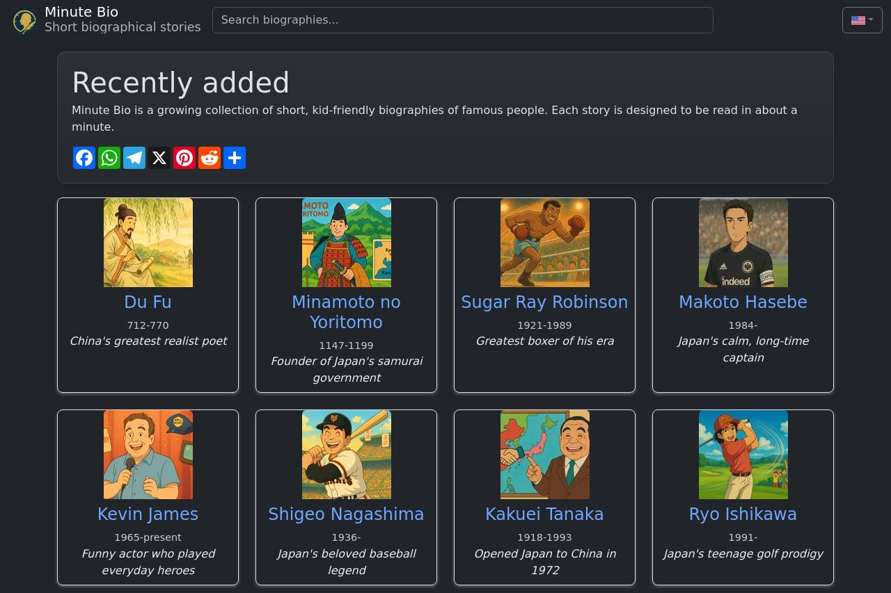
The landing page for Minute Bio is engaging and visually appealing with its grid layout showcasing various personalities. Bold colors and character illustrations grab attention effectively, but the overall layout tends to feel repetitive and somewhat cluttered due to the uniformity of the content blocks, which can make it hard for specific figures or key information to stand out. The value proposition about "short, kid-friendly biographies" is clear and straightforward, which is a strong point for its messaging.
The typography is readable, and the simplistic approach suits the context of children's content, but the design lacks differentiation in hierarchy, making navigation a bit challenging. The call to action is essentially absent, with no clear guidance on what users should do next. It needs more emphasis for better usability and conversions.
In terms of credibility, there appears to be no social proof or trust signals present, such as testimonials, which could be an opportunity to add more depth and trustworthiness to the site.
- Introduce a clear call-to-action, like 'Read Now' or 'Explore More', to guide users effectively.
- Diversify the layout to avoid repetitive structures and enhance individual significance for each biography.
- Add social proof elements like testimonials or educator endorsements to increase credibility.