norri.co
Landing Page Analysis
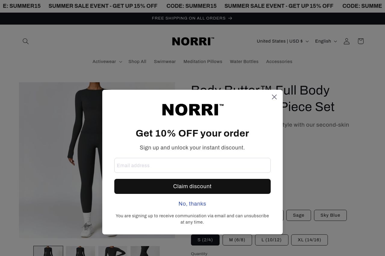
rap your body in buttery-soft luxury with the Body Butter™ Full Body Seamless Two-Piece Set — designed to feel like a second skin while sculpting, smoothing, and supporting you through every movement.
Summary:
The landing page has a sleek design and is visually appealing, but suffers from poor usability due to an irritating popup that dominates the screen. This obnoxious popup appears across various sections, distracting from valuable content. While the product description is detailed, it is somewhat vague and not clearly broken down, making it hard to grasp the specifics. The reviews are a strong point, adding credibility, but they are hard to focus on because of the persistent popup. Key action areas like CTAs do not stand out effectively. Consistent branding efforts are apparent but compromised by structural inefficiencies and an overwhelming amount of information. Pricing is visible, which is good, but it's not immediately linked effectively with value proposition or compelling reasons to "Add to cart." Overall, the page attempts to communicate product value and cultivate trust but is hampered by a poor user experience and confusing calls to action.
- Remove or reduce the frequency of the intrusive popup to improve user experience.
- Clearly define and convey the product’s unique selling propositions clearly and concisely.
- Improve the CTA design and placement to make them more engaging and visible.