davantis.com
Landing Page Analysis
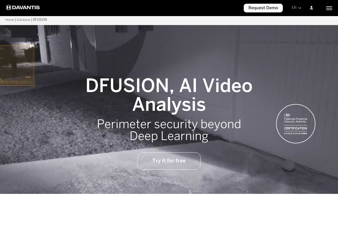
Improve your perimeter security system with DFUSION, a cost-effective, robust and scalable solution based on AI. We detect the impossible!
Summary:
The landing page attempts to portray confidence and innovation with its AI-driven security solutions, but several issues hold it back. The messaging is somewhat clear and focuses on security and technology, but it lacks audience-specific examples and an engaging tone. The mix of images, videos, and icons overloads the page visually, sacrificing clarity and simplicity. The design is consistent but uses bland colors that don’t enhance readability or help important elements stand out. Notably, the cluttered layout disrupts the structure and flow, making it difficult for the user to follow the narrative seamlessly. The actionability is compromised by generic CTAs that don’t engage or compel action, and trust elements should be more pronounced to elevate credibility. The readability of text suffers from excessive jargon and blocky paragraphs, making the value proposition harder to digest for non-experts. Overall, it's a robust attempt but needs a heavy dose of refinement to break through the clutter and speak directly to the target audience.
- Enhance focus by reducing visual clutter and enhancing text hierarchy.
- Refine CTAs with more specific action-oriented texts.
- Improve readability with simplified and engaging language.