tupausa.com
Landing Page Analysis
app de hipnosis, platafoma de hipnosis
Summary:
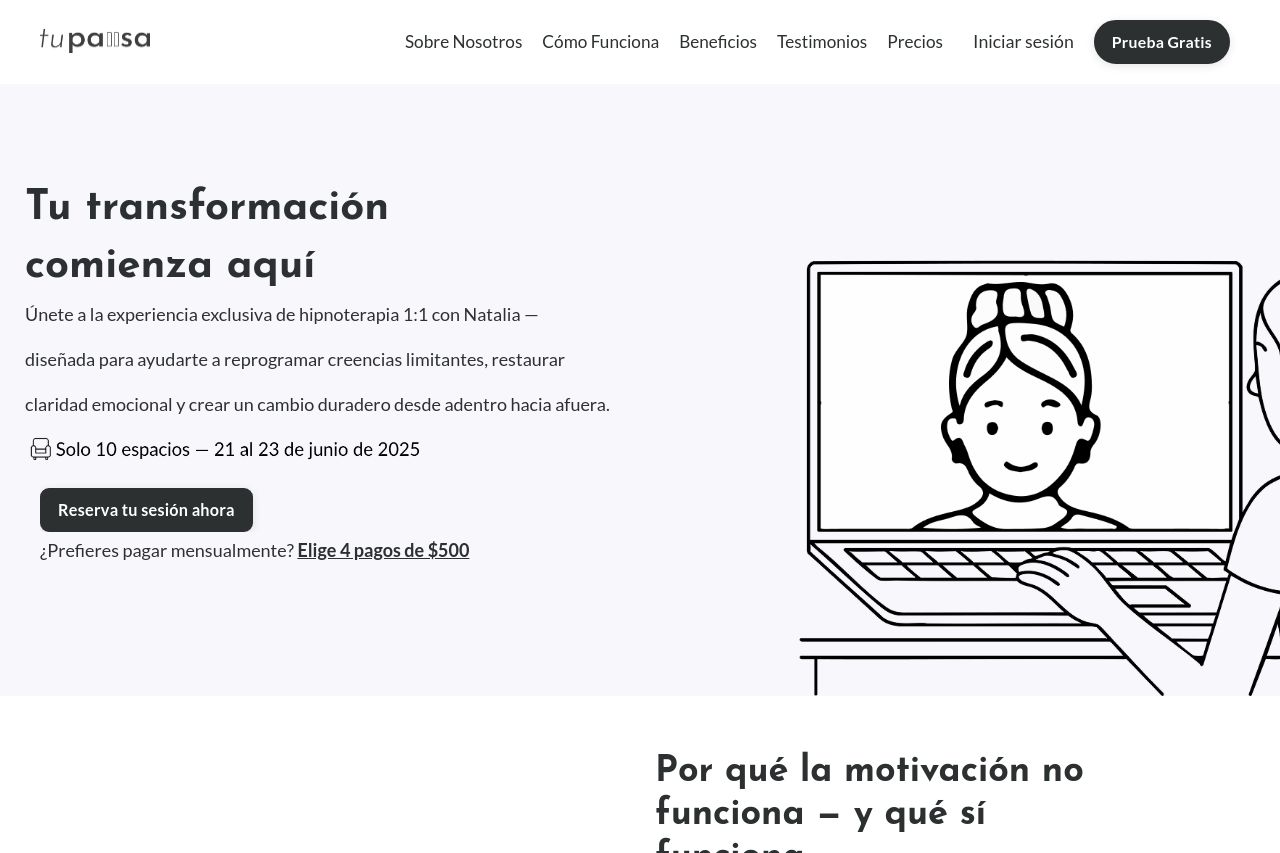
The landing page is visually calm and aligns with the brand’s message of emotional clarity and transformation. The illustrations are consistent and add a friendly touch, which suits the therapeutic theme. The simple color scheme aids readability, matching the target audience of potentially stressed or busy individuals looking for clear solutions.
However, the page is plagued by a lack of strong value proposition upfront. The text, while descriptive, is a bit too detailed and loses impact quickly. Important points and benefits are there but buried under verbose explanations. The call-to-action is clear, but redundancy in some sections could lead to confusion or missed opportunities.
The design needs refinement. While visually consistent, it lacks strong visual hierarchy, and certain elements don't stand out as they should. For instance, the "Reserve tu sesión ahora" button is prominent but repeated excessively, which can dull its impact. The testimonials are a positive inclusion but could be more compelling with more context or varied formats.
- Clarify and strengthen the main value proposition on the hero section to immediately engage users.
- Reduce the amount of repetitive text to maintain user interest and emphasize key benefits.
- Improve visual hierarchy by using more diverse fonts and colors to guide the reader’s focus better.