mykajabi.com
Landing Page Analysis
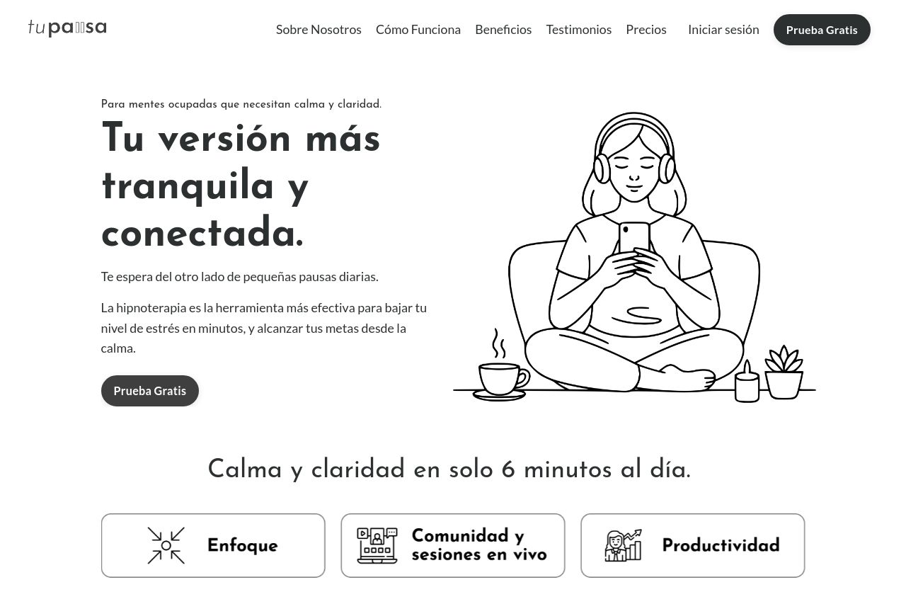
Te espera del otro lado de pequeñas pausas diarias.
75
Generated on:
September 4, 2025Score:
75/100Share on:
Summary:
60
Messaging
85
Readability
80
Structure
60
Actionability
75
Design
70
Credibility
The overall layout showcases a minimalistic and consistent design, which is generally clean and professional. The choice of a black-and-white color scheme is safe but lacks any pop to draw attention. Headings and text are clear and structured, with good use of whitespace, but some sections feel overly simplistic without engaging visuals or interactive elements. The messaging lacks urgency or a strong call to action and the benefits aren't fully convincing, although the presence of testimonials adds some credibility. A bit more emotional appeal and energy could entice users to engage more readily.
Main Recommendations:
- Enhance visual engagement by adding more colors or interactive elements to highlight key features.
- Improve CTA urgency with stronger language like "Join Now" instead of "Prueba Gratis."
- Incorporate more visuals or icons to break up text-heavy sections and maintain interest.