abhinavvdubeyy.com
Landing Page Analysis
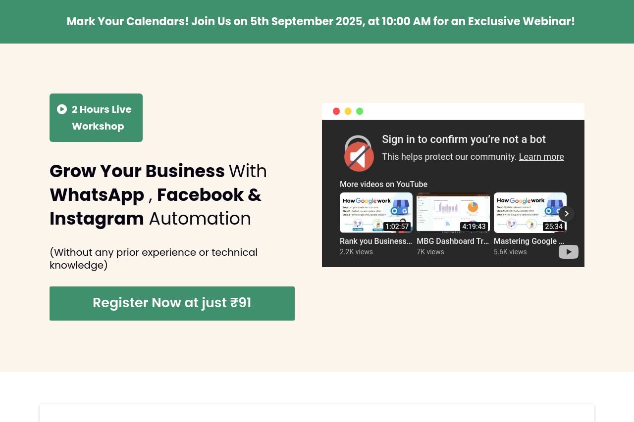
🔔 Mark Your Calendars! Join Us on 5th September 2025, at 10:00 AM for an Exclusive Webinar!

Summary:
The landing page does a decent job of promoting the workshop with a clear value proposition centered around automation and ease of use with platforms like WhatsApp, Facebook, and Instagram. The urgency and low pricing strategy could work, but the execution feels overwhelming. The constant repetition of the price in red and the countdown timer could come off as desperate. The content is structured logically, but it becomes cluttered with too many repetitive CTAs. The design attempts a coherent color scheme, yet the abundance of green and lack of color variation makes important elements blend in too much. Overall, it's a good attempt, but the page misses out on being truly engaging or memorable.
- Reduce redundant CTAs to improve focus.
- Improve color contrast to enhance visual hierarchy.
- Simplify the text to make it more concise.