althara.it
Landing Page Analysis
Diagnosidefinitiva
Summary:
The landing page attempts to address the problem of joint pain directly with empathetic messaging and a clear call to action to book an orthopedic visit.
Good Points: The hero section quickly addresses the visitor's potential frustration with an engaging question, and the clear call to action "Scopri di più" is action-oriented. Testimonials and a high satisfaction rate add credibility. The contact form at the bottom is straightforward, framing scheduling as a step towards "moving without pain."
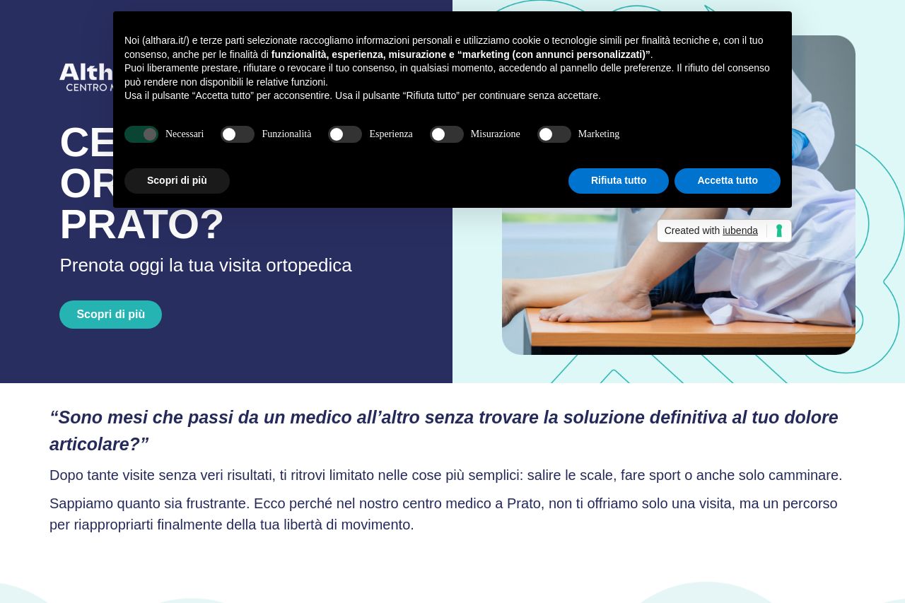
Bad Points: The repeated cookie consent popup is highly distracting and invasive, overshadowing the content and CTA. The text in some areas is cramped and lacks appropriate hierarchy, making it hard to digest. The visual design isn't cohesive; the use of contrasting colors isn't consistent, and graphics aren’t optimally utilized. CTA placement is not strategic, as it blends with the surrounding text rather than standing out.
To improve, the cookie consent should either be minimized or styled to be less intrusive. Boost the current CTAs so they stand out better on the page. Sharpen the visual hierarchy to guide the user's attention naturally and ensure colors complement each other for a consistent and professional look.
- Reduce the intrusiveness of the cookie consent popup.
- Enhance the visual hierarchy to guide user focus better.
- Make CTAs more prominent to increase conversion.
- Ensure colors are consistent and complementary for improved cohesion.