growdigitally.consulting
Landing Page Analysis
Performance focused digital marketing agency
Summary:
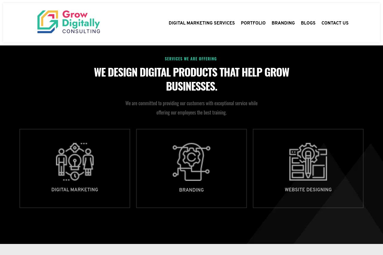
The landing page has some strong visual elements but is marred by a lack of clarity in messaging and a disjointed design approach. The value proposition is buried under clichéd statements like "WE DESIGN DIGITAL PRODUCTS THAT HELP GROW BUSINESSES," which doesn't clearly define what the company actually offers. The structure is somewhat coherent, but the lack of distinct headings and logical flow disrupts navigation. While the page uses visuals to support content, many images feel generic, lacking any unique branding that would distinguish the services offered. The contact information is transparently listed, adding a credibility boost, yet the page needs more structured social proof to enhance trust. Calls to action are present but not particularly compelling or well-placed, leading to a potential loss in converting visitors. The overall design incorporates a decent color scheme, but the inconsistency in typography and spacing creates a jarring experience, failing to maintain a cohesive aesthetic.
- Clarify the main value proposition directly and succinctly.
- Streamline the call-to-action placement for better conversion.
- Improve the visual hierarchy for better readability.
- Enhance the testimonials and client logos for stronger social proof.