minisite.ai
Landing Page Analysis
Srepra Digital Marketing boosts your brand with expert SEO, PPC, social media, email, content, affiliate, and direct marketing strategies for success.
Summary:
The landing page for Srepra Digital Marketing Agency has potential but falls short in several areas.
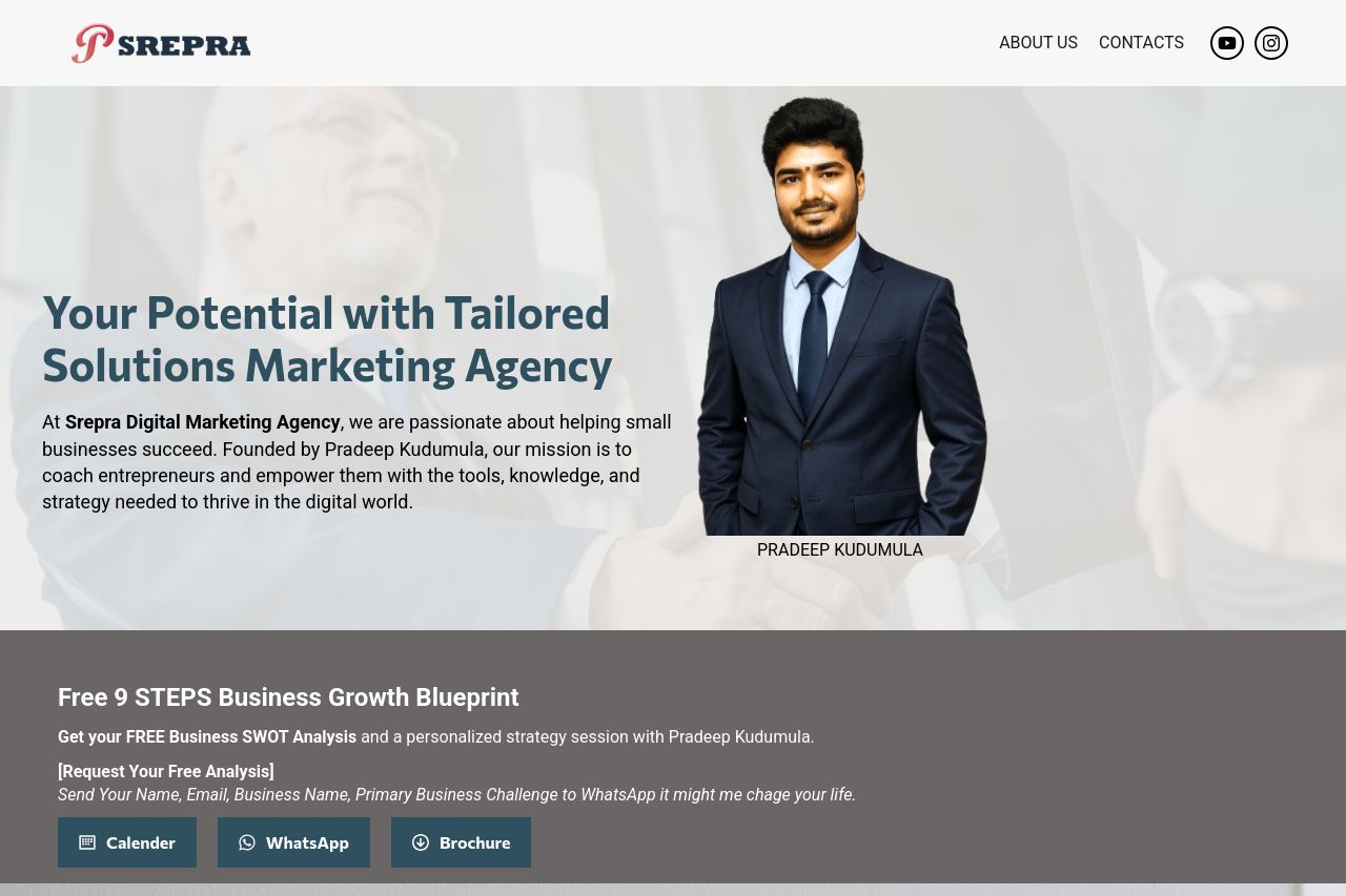
The value proposition is somewhat generic and fails to stand out. While the main header "Your Potential with Tailored Solutions Marketing Agency" tries to convey a personalized approach, it doesn't quickly communicate specific benefits or outcomes to the visitor.
The design is cohesive, with a consistent color scheme and typography that maintains professionalism, but the content layout is cluttered in some areas, like the packed features section. Typography generally maintains readability, although some areas could benefit from better contrast or distinctive styling, such as more prominent headings and better font sizing.
Messaging needs refinement for clarity and engagement. It communicates a friendly tone but misses the mark on impactful language. Phrases like "may change your life" lack specificity. Social proof is minimal, and while there's mention of the agency's credentials through Pradeep Kudumula, more elements like testimonials or clients logos could enhance trust.
The calls to action (CTAs), such as "Tap to Get Started," are visible but could be more distinctive and strategically placed to maximize conversions. Navigation is primarily linear, which is good for guiding users, but the heading styles are not very clear, making skimming a bit tedious.
Overall, the page is functional but does not yet maximize engagement or rapidly convey its unique value. Adding stronger credibility indicators and tightening up the messaging are critical next steps.
One typo in the footer detracts from professionalism,"WharsApp Us."
- Clarify your value proposition. Make it specific and outcome-focused. For example, add clear potential results like 'Boost your online presence and revenue by 30%.'
- Add social proof such as testimonials or client logos to build trust and credibility.
- Improve CTA distinctiveness and urgency. Use more action-oriented and specific language like 'Start Your Growth' or 'Book Your Free Audit'. Consider placing them more strategically across the page.
- Simplify text and enhance contrast for better readability, particularly in dense sections.
- Fix the typo in the footer from "WharsApp Us" to "WhatsApp Us" to improve professionalism.