beerandpub.com
Landing Page Analysis
Commercial Partner
Summary:
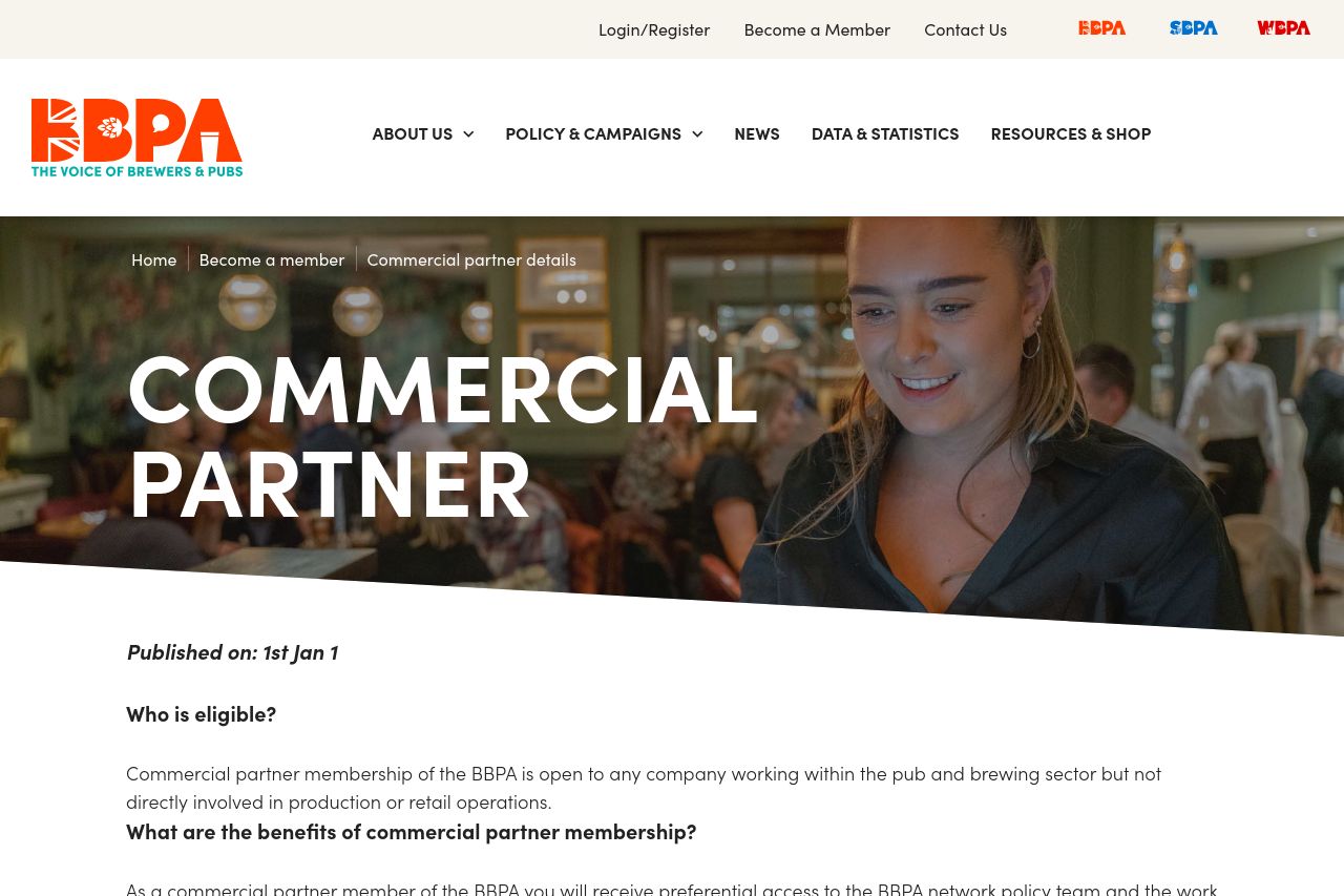
The page tries to communicate the benefits of becoming a commercial partner but fails in execution. The hero section lacks a strong visual appeal or clear message to engage visitors right away. The use of a generic image doesn't add value or connect it to the core offering. Information about benefits is presented in a standard list but lacks compelling visuals or concise, convincing copy. The application form is straightforward yet uninspiring, leaving out any sense of excitement or urgency.
Overall, the value proposition is buried in dense text that won't engage the visitor's interest, especially given the lack of visual emphasis and action-oriented language. A stronger focus on both visual appeal and copywriting could significantly improve engagement and conversion.
- Enhance the hero section with a strong, clear headline that highlights the primary benefits.
- Use more engaging and visually compelling images related to the pub and brewing industry.
- Incorporate bullet points or visuals to break up text-heavy sections and improve readability.