hillhurl.com
Landing Page Analysis
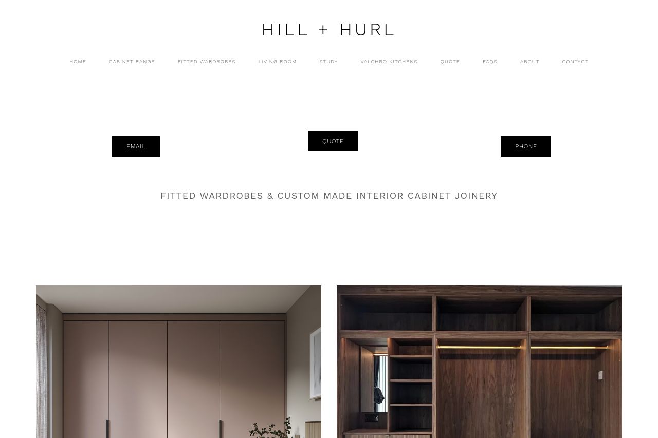
Fitted wardrobes London. Discover stylish and functional fitted wardrobe solutions in London. Hill & Hurl offers custom-designed wardrobes to maximize your space.
Summary:
This landing page is a mixed bag; while it offers promises of quality craftsmanship with a focus on custom solutions, the execution is less than stellar. On the positive side, the value proposition of creating fitted wardrobes is clearly articulated. However, the overall design, visual hierarchy, and structure do not support this message effectively. The cluttered elements, clashing colors, and inconsistent design consistency distract from the core message. The readability suffers due to lack of text simplicity and poor typography choices. Moreover, there is a serious lack of credibility markers, such as trust badges or client testimonials, which could reassure potential customers. The CTAs blend too much with the background, failing to draw attention. The structure of the information is not optimized to guide the user through a journey of discovery and purchase decision-making. The lacking professionalism and transparency, paired with a lack of credibility elements, do not inspire trust.
- Improve the font sizes and weights to create a clear visual hierarchy so important elements are easily distinguishable.
- Include more social proof elements like testimonials and trust badges to strengthen credibility.
- Enhance the CTA's design to make it stand out from the surrounding content and encourage user interaction.
- Clear up the clutter by optimizing whitespace and ensuring elements have sufficient room to breathe.