rajalacamera.fi
Landing Page Analysis
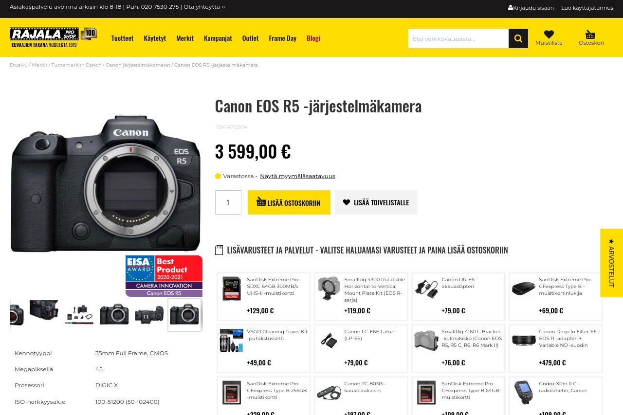
Osta Canon EOS R5 -järjestelmäkamera netistä. Täältä löydät järjestelmäkamerat, kompaktikamerat, kuvauskopterit ja muut kamerat sekä laitteet.
Summary:
The landing page does a decent job showcasing the Canon EOS R5 camera, with its sleek design and obvious intrigue for enthusiasts. However, it misses out on being truly engaging due to some cluttered visuals and underwhelming call-to-action elements. The product description is exhaustive but feels monotonous and could certainly benefit from more engaging formatting. The color scheme is adequate but lacks a pop that could make crucial elements and CTAs stand out more. While the site includes trusted branding and awards to boost its credibility, the layout doesn’t leverage hierarchy effectively enough, leading to potential overwhelm for users. Overall, it misses an opportunity to simplify and enhance user navigation and purchasing decisions.
- Enhance the CTA buttons by using a color that truly stands out from the background, like bright orange or blue.
- Break down the lengthy product description into bullet points or sections to improve readability.
- Improve visual hierarchy by using larger headings and more distinct sections to guide users.