mind4winners.com
Landing Page Analysis
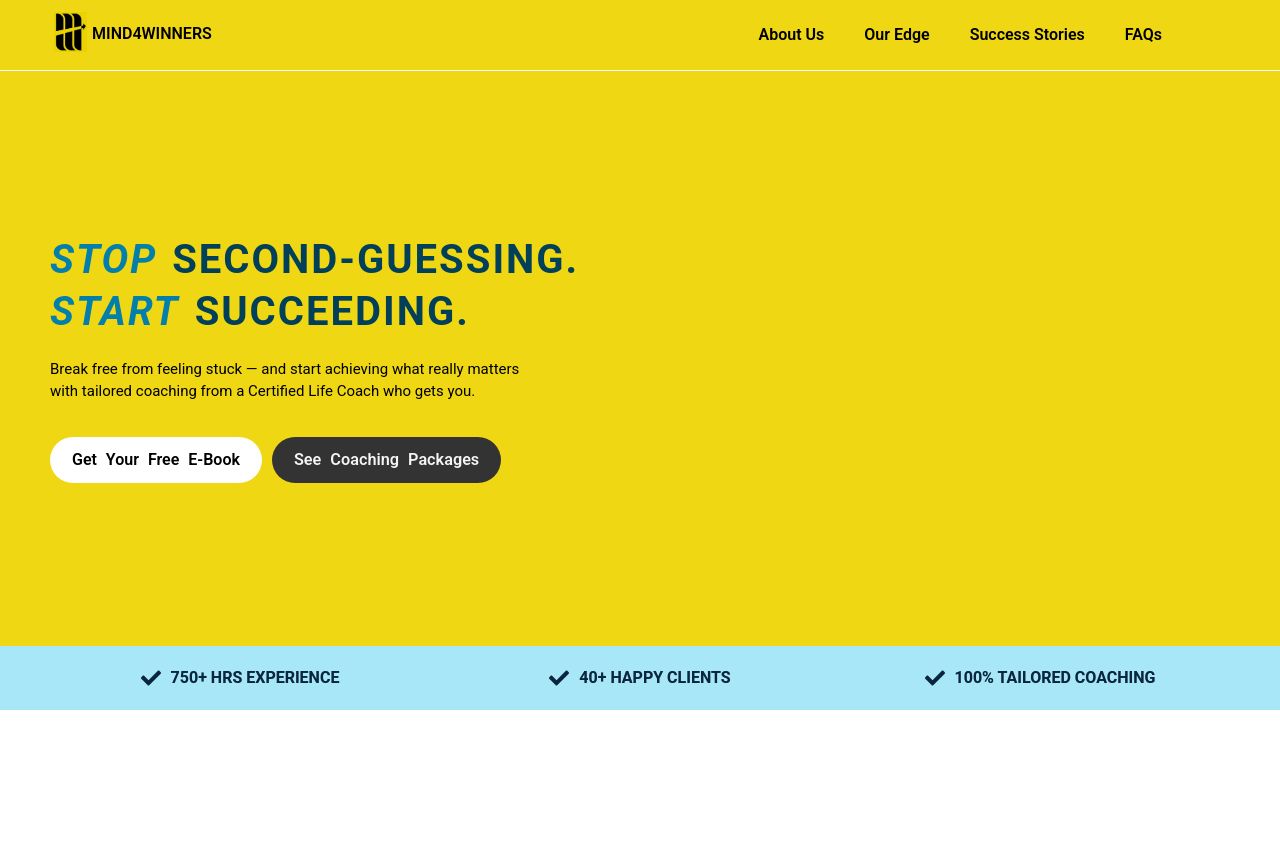
Break free from feeling stuck — and start achieving what really matters with tailored coaching from a Certified Life Coach who gets you.
Summary:
The landing page of Mind4Winners aims to capture attention with its bold yellow color scheme and straightforward messaging. However, the color choice is harsh and strains the eyes, distracting from key information.
The value proposition is somewhat clear but lacks a unique punch to differentiate from generic life coaching offers. The text tries hard to appeal to both emotional and logical elements - like breaking through mental blocks and structured coaching - but ends up being too predictable and uninspiring.
**The readability is decent with good use of bold text to highlight key points, though some paragraphs are unnecessarily long, burdening the flow. There's also inconsistency in typography - too many styles disrupt the reading experience.
Structurally, the page is over-reliant on text, with missing visual aids that could offer a better understanding of the coaching process. Social proof is nearly absent; a huge credibility red flag for skeptical prospects.
- Revise harsh yellow background to a more subtle color to improve readability.
- Define a unique value proposition to stand out from other coaching services.
- Add testimonials and social proof elements to build credibility.