france.fr
Landing Page Analysis
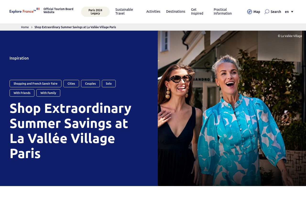
Just 40 minutes from central Paris, La Vallée Village is more than a shopping destination. With remarkable savings on leading French and international brands, t
Summary:
The landing page attempts to promote La Vallée Village as an upscale shopping destination with strong summer savings. The hero section is visually engaging, leveraging vibrant imagery to grab attention. The use of breadcrumb navigation is clear, but the cookie consent popup is intrusive and poorly placed, disrupting initial user experience. While the message of up to 70% discount is highlighted, the overall messaging lacks compelling urgency or persuasion to make users act. The typography is consistent, but the content layout feels repetitive without clear differentiation between the sections. The benefits of the eVIP pass are presented but could use more enticing language. The call to action is present but doesn't stand out enough to guide user decisions confidently. Visual hierarchy attempts to lead the eye, yet it's muddled by a lack of differentiation in font sizes for headings and subheadings.
- Enhance the CTA buttons to make them more distinct and action-oriented.
- Remove or reposition the cookie consent popup to avoid user distraction.
- Strengthen the urgency and exclusivity of the offers to drive conversions.