easypapiro.com
Landing Page Analysis
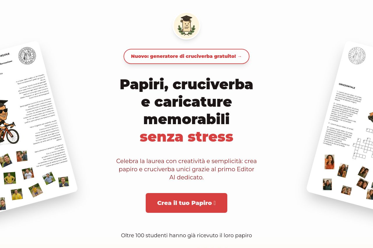
Celebra la laurea con creatività e semplicità: crea papiro e cruciverba unici grazie al primo Editor AI dedicato.
73
Share on:
Summary:
66
Messaging
62
Readability
80
Structure
60
Actionability
68
Design
80
Credibility
The landing page has a clear and engaging approach for students seeking graduation gifts without stress. The headline is bold and straightforward, conveying the main value proposition effectively. However, there's room for improvement in scannability and clarity. The design is consistent but somewhat bland in color contrast, lacking visual punch to make key points pop. CTAs are present but aren't attention-grabbing enough, blending too much with the rest of the text. Social proof is visible but could be more diverse, such as showcasing more client interactions or partnerships.
Main Recommendations:
- Increase contrast in CTA buttons to make them stand out more.
- Add more detailed social proof, such as varied testimonials or endorsements.
- Consider revising the tone to be slightly more engaging and tailored to students.