relevantaudience.com
Landing Page Analysis
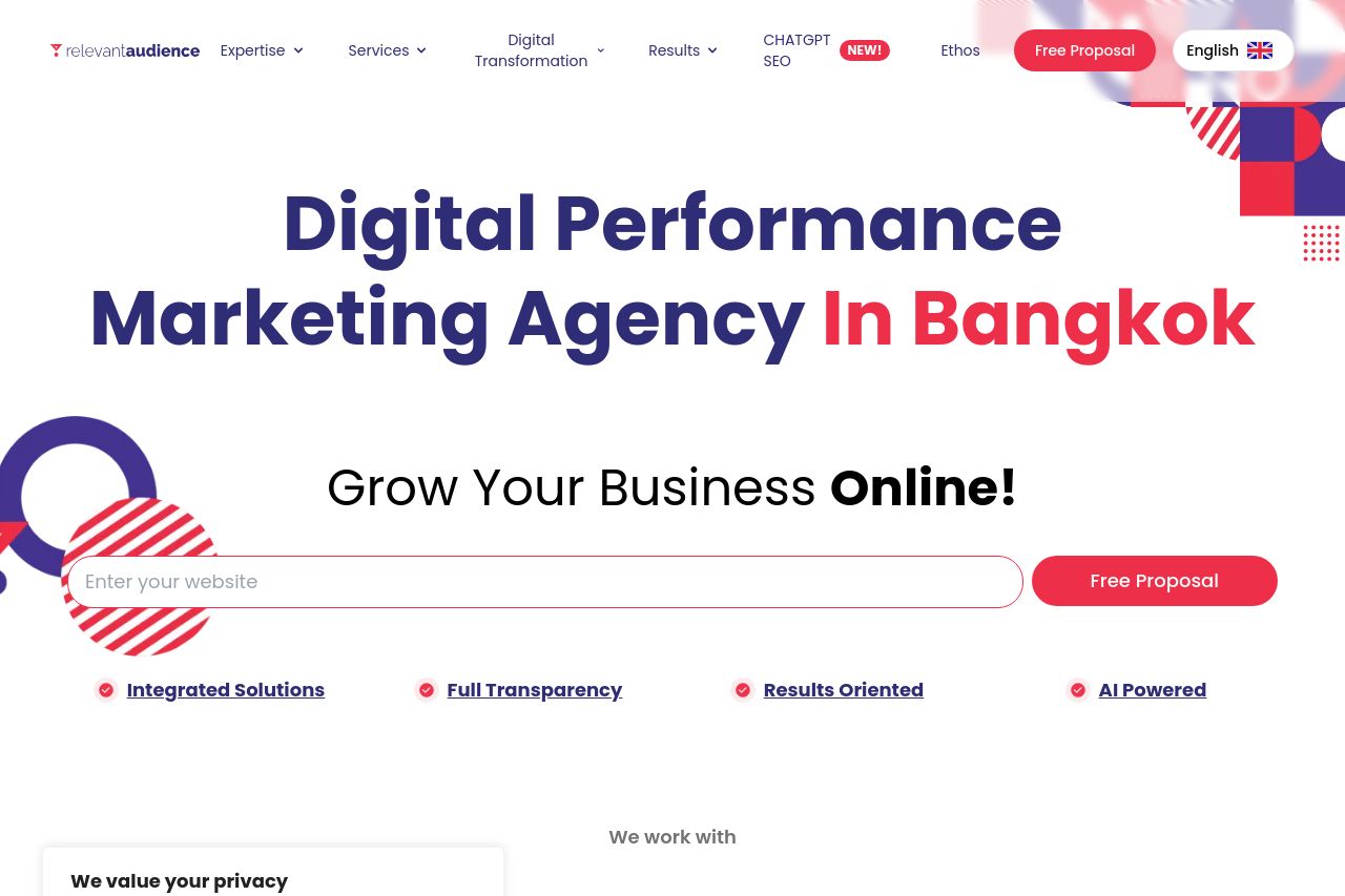
Digital marketing agency in Bangkok which focus on performance, bringing relevant traffic and leads/sales to your company. Google Ads
70
Share on:
Summary:
60
Messaging
50
Readability
70
Structure
60
Actionability
65
Design
100
Credibility
Meh. The value proposition is clear, but the site feels cluttered thanks to excessive graphics and cookie banners muddying the focus. Color scheme aligns with the brand, but the red text on buttons sometimes disappears into the background. Information is mostly well-organized, but the text blocks are too heavy and verbose for online reading. Consistency is nice, yet some visuals feel more decorative than functional. CTAs are placed decently but don't stand out amidst all the visual noise. Trust elements are present, like testimonials and client logos, lending credibility.
Main Recommendations:
- Simplify and declutter text-heavy areas to improve readability.
- Enhance the visibility and actionability of CTAs by using distinct colors.
- Eliminate distracting elements like unnecessary graphics to focus user attention.