blankedge.co
Landing Page Analysis
Elevate your brand's online presence with Blankedge's expert social media and digital marketing solutions. Drive engagement, boost conversions, and achieve measurable results today.
Summary:
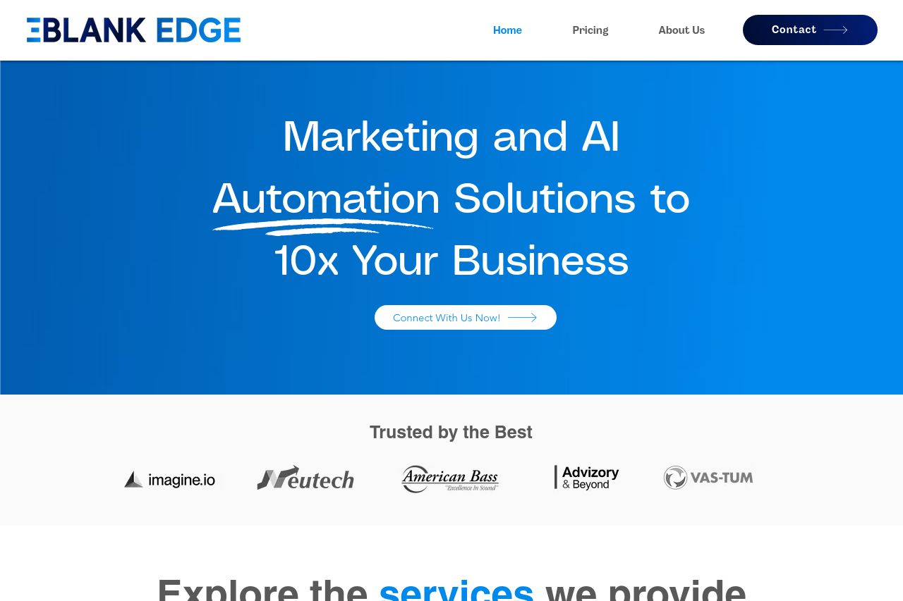
The landing page starts with a bold promise of 10x business growth using AI marketing and automation, which is attention-grabbing but perhaps a bit too ambitious for credibility. While the headline tries to be impactful, it needs a more grounded value proposition. The design uses a blue color scheme that suggests professionalism but lacks contrast in certain areas, making some sections blend too much into the background. There are good trust elements with client testimonials and recognizable logos, which add credibility. However, the call-to-action buttons, like "Connect With Us Now!" and "Contact Us Now," are rather generic and scattered, leaving the user unclear about the primary action to take. The use of icons is consistent, though the page feels visually cluttered at certain points due to the dense placement of text and elements, disrupting readability. There’s an attempt to convey results with detailed metrics in the case studies, but these blocks could use more visual distinction and hierarchy to elevate important data. The Provided services section uses icons efficiently to communicate availability, but it's overshadowed by other page elements competing for attention. Overall, while it presents a promising offer, it lacks clarity in guiding users through the value journey effectively. The presence of an email address without a link is unprofessional.
- Define a clear and specific main call-to-action to guide user actions.
- Increase contrast in the design to emphasize crucial elements.
- Refine and specify the main value proposition for clarity and credibility.
- Use fewer but more targeted testimonials to emphasize impact.
- Improve visual hierarchy to guide reading flow more effectively.