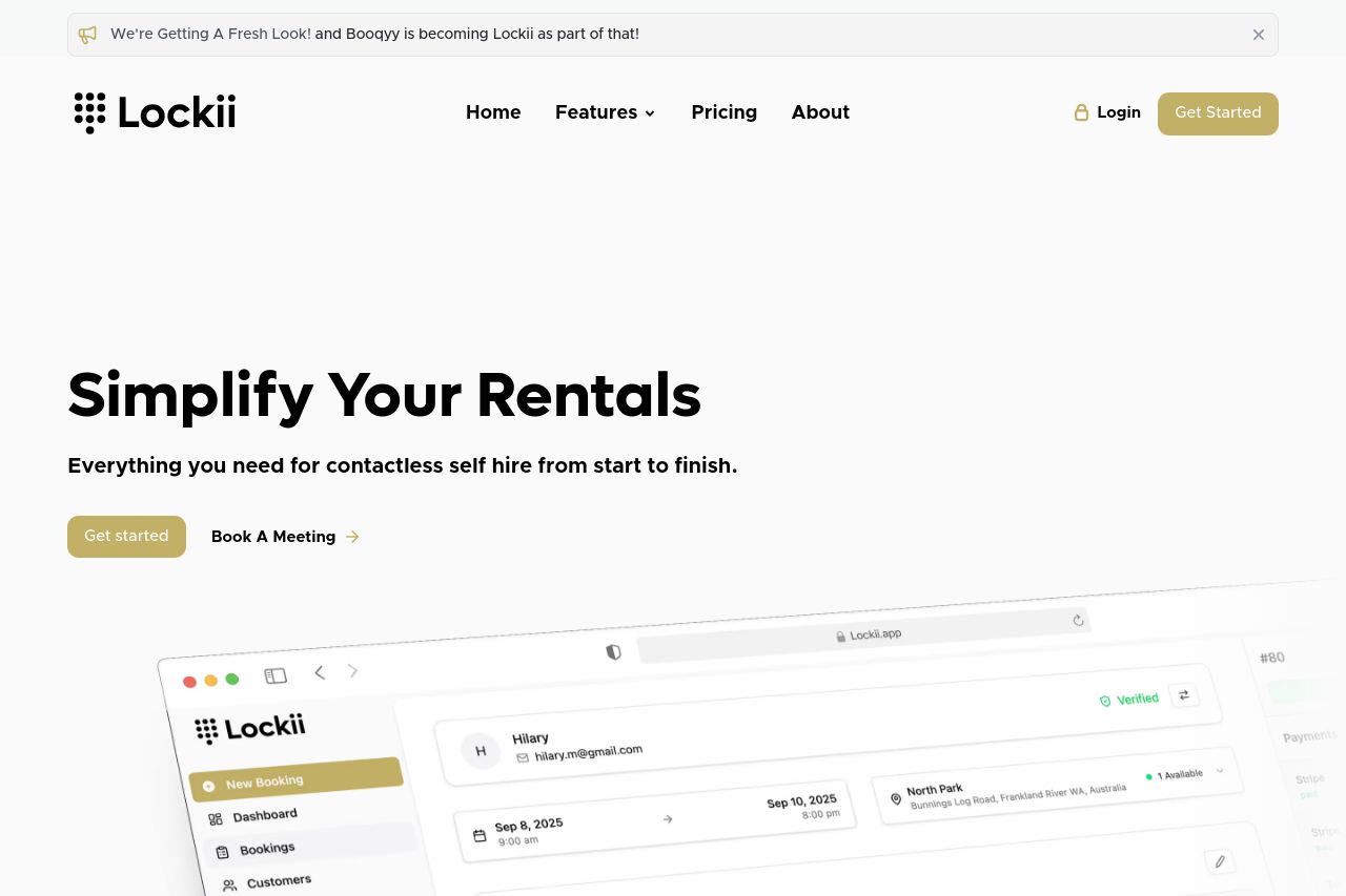
lockii.app
Landing Page Analysis
Everything you need for fully automated self-service hire from start to finish, digital locks, embeddable widgets, identity verification, sms automation, customer booking management, GPS tracking and

Summary:
The open graph data is a mess of information, and it's suffering from a serious identity crisis. The title does tell you it's about contactless hire software, which is at least somewhat informative. However, the description reads like a shopping list that goes on and on. It's crammed with features and does nothing to make potential customers' eyes light up. Nobody's going to be excited reading "SMS automation" or "embeddable widgets." And as for the image, it better be something eye-catching because the text sure isn't doing the heavy lifting. You need something snappy and enticing that makes people curious enough to click, not overwhelmed before they even start.
- Simplify the description to 1-2 exciting benefits, e.g., 'Scale your rental business with our all-in-one self-service hire solution.'
- Ensure the image captures the unique selling point visually, like people using the app successfully.
- Emphasize urgency or exclusivity in the title or description, e.g., 'Join the rental revolution now!'