accelra.io
Landing Page Analysis
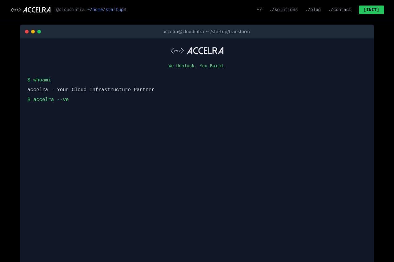
We unblock your engineering team with expert infrastructure consulting. DevOps automation, cloud architecture, security & compliance for startups. From chaos to scale-ready infrastructure.
Summary:
The design evokes a terminal interface, appealing to tech-savvy users, but severely lacks clarity and organization. The messaging is overly obfuscated with command-like text, making it difficult to quickly grasp what the company does. Call-to-action buttons like "INIT" and "Enter Execute Command" are misleading and lack intrigue or urgency. Social proof elements are poorly displayed within a mock terminal log, which might amuse some tech professionals but won't instill confidence in most viewers. Readability is compromised by dark colors and small text, reducing engagement. While the style might be intentional, the site's cryptic nature likely alienates potential customers rather than attracts or informs them.
- Clarify the value proposition prominently on the homepage.
- Simplify the language and reduce command-line aesthetic for broader appeal.
- Enhance readability with better contrast and larger text sizes.