tendivenue.store
Landing Page Analysis
Transform Your Core & Power Up Your Fitness Game! 💪✨ Ready to burn belly fat and tone your core and take your workouts to the next level? Our Tummy Trimmer is your go-to fitness partner — whether
Summary:
The landing page for the Tummy Trimmer Double Spring has both hits and misses.
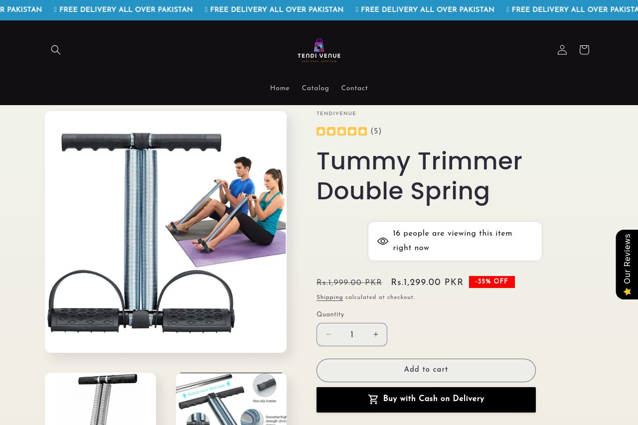
On the positive side, the product images are clear and informative; they illustrate the product's features well and help potential buyers visualize use. The reviews give a sense of trust with positive feedback, and elements like 'Free Home Delivery' are well-positioned to entice.
However, the layout struggles with readability and visual clutter. Headings don’t stand out enough, making it difficult to skim through quickly. Long paragraphs and compact sections make the flow choppy. The CTA 'Buy with Cash on Delivery' stands out but needs a more persuasive call like 'Grab Yours Now.' There’s an overall lack of hierarchy, causing important information to blend into the noise of the page.
- Increase the visual hierarchy by using larger font sizes for headings and more defined contrasts.
- Simplify and shorten text to create bite-sized, digestible chunks of information.
- Make CTAs more compelling and action-oriented, e.g., 'Grab Yours Now for Free Delivery!'