tobbleberry.com
Landing Page Analysis
"I'm satisfied so much, this is a need of every cat owner. It catches cat litter, and my dumbass cat even peed on it already, but it stays in those little holes and not leaking anywhere. Totally water
Summary:
The TidyPad product page has a solid foundation but needs some sharpening.
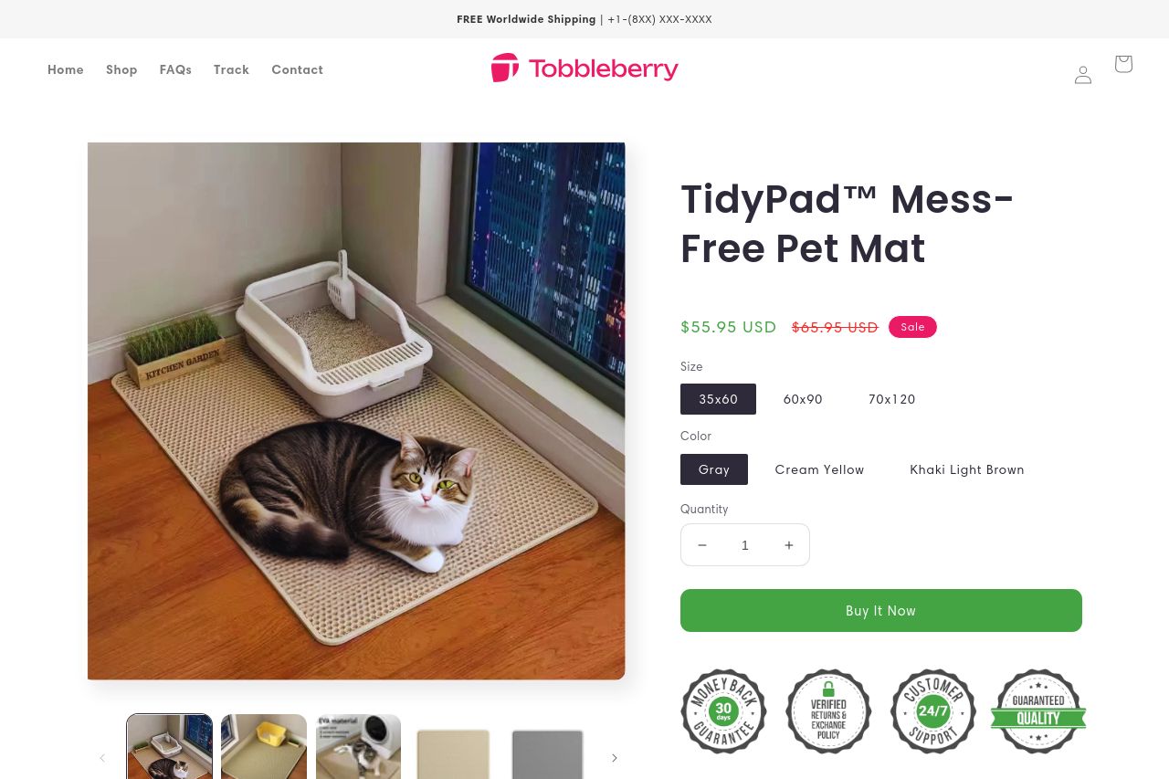
The value proposition is relatively clear, articulated through the litter-trapping design and ease of cleanliness. The consistency in design elements and the ample use of positive testimonials add a layer of credibility. The visibility of the CTA and familiar logo serve as hooks for potential buyers. However, the lack of direct urgency in the CTA and the minor clutter in the visuals dilute focus and interest. While the information is organized logically, some sections could benefit from reduced redundancy. Structurally, the information could be more impactful at the top and flow more naturally. It’s tidy but could be tidier.
- Enhance CTA by adding urgency, like 'Limited Offer.'
- Improve visual hierarchy by de-emphasizing less crucial elements.
- Refine section organization for smoother reading flow.