t-akibet.com
Landing Page Analysis
Avukatlar için güvenilir UYAP asistanı. Hızlı Tebligat sorgusu. Emek ve zaman tasarrufu.
Summary:
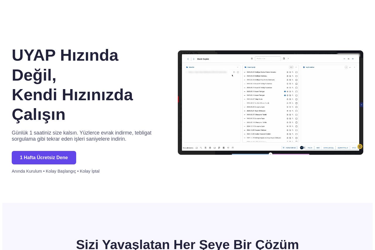
The page clearly targets legal professionals looking to streamline their tasks with a promise of saving time. The headline "UYAP Hızında Değil, Kendi Hızınızda Çalışın" effectively conveys the main benefit, though it could be more explicit about the scope of services—mainly due to the lack of a concise call to action initially. The design is clean, with a balanced use of colors, but could use more emphasis on visual hierarchy to better differentiate section importance.
Readability suffers slightly due to some jargon and the lack of bold headings to guide the eye across sections. The CTA could be stronger and more diverse, perhaps with a variety of action verbs to drive engagement. Despite some descriptive explanations of features, the overall structure could be better organized to enhance the user journey.
The focus on credibility is somewhat effective with a testimonial, but it lacks comprehensive social proof or trust badges. The Open Graph data is decently aligned with the product theme, but the simplistic logo doesn’t capture much attention. Improve these aspects for a more powerful overall presentation.
- Clarify the main value proposition with more details about what the product offers.
- Differentiate section headings and details to guide the reader more effectively.
- Enhance CTA buttons with varied and specific action verbs to increase engagement.