harisberberian.com
Landing Page Analysis
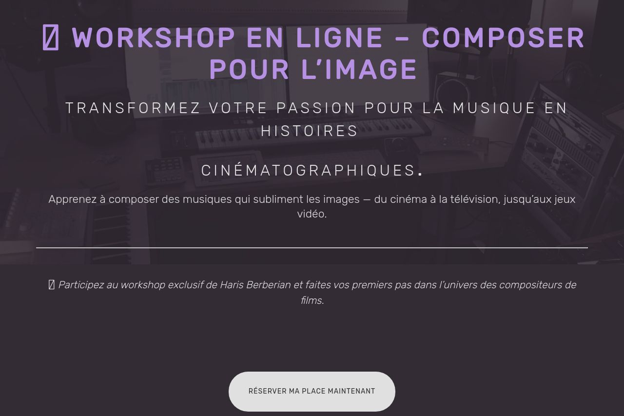
WORKSHOP - Music_for_films. Haris Berberian
Summary:
The page does an excellent job of targeting its audience—those passionate about composing for films and media. The key sections explain the workshop's goals and benefits, aligning well with aspiring composers' needs. The value proposition is clear, reiterated throughout, and examples cater to both amateurs and professionals interested in enhancing their skills. The tone is appropriate and inspiring.
However, the readability is mildly compromised due to some long paragraphs and muted color contrasts, particularly the minimal distinction between headings and body text. The CTA is plainly visible but lacks any sense of urgency or uniqueness that might compel a quick response. Also, the layout feels a bit crowded, especially in areas packed with testimonials and mentor profiles.
Visually, the website maintains a cohesive color scheme, but the dull palette risks lacking energy. The consistent use of imagery supports the credibility by showcasing real-life work, which is a definite positive. Overall, while many foundational elements are strong, there is a need for improvements in engagement techniques and visual variety to make the site truly standout.
- Enhance CTA text: Make the button more actionable and appealing, such as 'Start Your Journey Now'.
- Improve readability: Break up dense blocks of text and use more visually engaging methods like bullet points or icons.
- Use contrast wisely: Enhance the color contrast between text and background to improve readability.