gobotty.nl
Landing Page Analysis
Gobotty: op maat gemaakte robotiseringsoplossingen op basis van een abonnement. Ontdek de voordelen en mogelijkheden!
Summary:
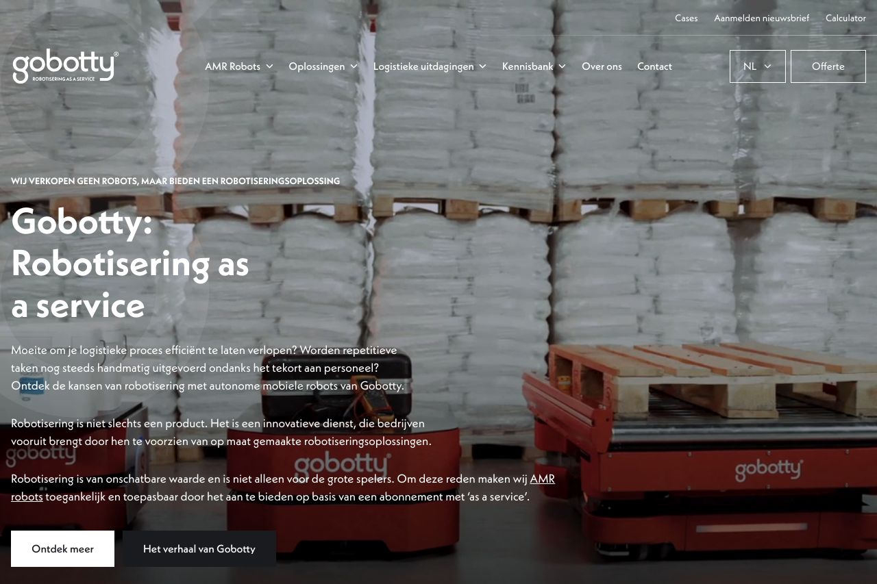
Gobotty's landing page aims to present robotic automation solutions with a subscription model. The value proposition is somewhat clear, emphasizing efficiency and customized solutions. However, it's heavily text-laden, which might overwhelm users rather than engage them. While imagery tries to break up the text, it often fails to visually communicate the core benefits. The call to action lacks urgency or compelling reasons to interact further, causing potential drop-offs. Tone-wise, the language is generally consistent, but it feels more informative than persuasive.
The structure needs refinement to guide the reader through a logical journey, as information seems scattered. Credibility elements aren't prominently highlighted; more tangible social proof or recognizable client logos could build trust. Consistency in design is a high point, although bold colors could detract instead of enhance if not balanced well. Lastly, while it addresses logistics challenges, the audience might need more specific use-case scenarios to visualize the benefits.
- Simplify the text to make it more accessible and engaging.
- Enhance the visual hierarchy to highlight key points better.
- Introduce more compelling CTAs to drive action.